Image by Stephen Laporte, freely licensed under CC BY-SA 3.0.
Article edits become musical bubbles. User languages become maps. Volunteer communities become circles of connections. World history becomes a sliding timeline.
Read on for 15 of our favorite data visualization projects from the last 15 years of Wikipedia.
Listen to Wikipedia
Stephen LaPorte and Mahmoud Hashemi
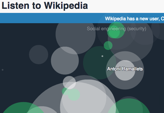
In musical bubbles, recent Wikipedia edits pop across the screen of “Listen to Wikipedia.” The pitch of each note and the size of the bubble indicate the size of the edit. Small changes are high-pitched blips while big changes echo. Watch the top of the screen. You might see a new user announcement set to the sound of strings. Wikipedia is always evolving. And in “Listen to Wikipedia,” you’ll hear the live symphony of its change.
Terra Incognita
Gavin Baily and Sarah Bagshaw
What is the terrain of a language on Wikipedia? What parts of the world are known in Hebrew but invisible in Japanese? In “Terra Incognita,” Wikipedia articles with geo-code data are mapped back to the parts of the world they represent and color coded per language. Select a few languages and explore the planet as a constellation of known and unknown spaces. It’s a colorful Wikipedia world out there, but there is so much terrain to discover.
Wikipedia Gender
Santiago Ortiz
Which topics do men edit more often than women on Wikipedia? That’s the question that behind the interactive “Wikipedia Gender” chart, designed with a data set in 2012. Along the center y-axis run articles that are revised increasingly more by female contributors. Along the x-axis run articles crafted by more men. In the center of the graph are articles like “Mr. Roger’s Neighborhood” and “A Tale of Two Cities” – which share a near equal gender parity.
Backstory: 13 Years of AIDS/HIV On Wikipedia
Florian Kräutli
As the discourse around AIDS/HIV has changed, so has its Wikipedia article. In “Backstory,” 13 years of revisions on the English-language AIDS/HIV Wikipedia article are charted. The study reveals a constant, contested, and collaborative effort to understand this global pandemic.
Africa on Wikipedia
Ralph Straumann, Mark Graham, Bernie Hogan, and Ahmed Medhat
What is the online visibility of African nations? In a series of distorted maps, “Africa on Wikipedia” shares a striking set of answers. Using 3.7 Million Wikipedia articles from 2013, and searching for topics geotagged into African nations, the project renders a map of Africa created solely by free knowledge. Then it offers a comparison map on the right. Cross-reference ‘population’, ‘internet connection,’ ‘gross domestic product’ and more against the density of Wikipedia articles to consider how much more visibility is needed for Africa today.
Histography
Matan Stauber

Image by S Page, freely licensed under CC BY-SA 4.0.
World history is on a sliding scale in “Histography.” Across a resizable timeline, small black dots mark historical milestones. Click to select a moment, and explore the Wikipedia sources. Play with the categories to filter history to ‘music’, ‘inventions’, ‘riots’ and more. Time has rarely appeared so succinct. But within each dot there are thousands of further paths on the Wikipedia articles through history and culture.
Wikipedia Radial Graph
Xefer
Since at least 2008, Wikipedia editors and readers have documented a phenomenon dubbed “getting to Philosophy.” It’s a simple set of rules that slowly but overwhelmingly link a topic back to the Wikipedia page for Philosophy. As of May 2011, 94.52% of articles could be successfully be connect to Philosophy. In the “Wikipedia Radial Graph” the simple rules are followed automatically to connect any search term back to the Philosophy root. Can you find one of the few articles that doesn’t connect?
One Year on Wikipedia
Valerio Pellegrini
A year is a long time, demonstrated by pageview patterns on Wikipedia. This project takes pageview data from the twelve months of 2013 and graphs them to show the evolution of popular topics as told by the Italian-language edition of Wikipedia. From film and television to sports and current events, the infographic documents how Italian readers navigated through the year.
Notabilia
Dario Taraborelli, Giovanni Luca Ciampaglia, and Moritz Stefaner
Whether or not to delete a Wikipedia article is a tough decision, and one that can lead to long and drawn-out discussions. This project maps those discussions—an editor suggesting to delete the article results in a swing to the center, while an editor arguing to keep pushes the branch to the right. The result is a tree of deletion discussions documenting visually the hundred longest such conversations of Wikipedia’s history.
What Is Wikipedia About?
Paul-Antoine Chevalier and Arnaud Picandet
This project takes more than ten million items from Wikidata, the free knowledge base providing public-domain data for the Wikimedia projects, and sorts them into broad, colorful categories. Almost a quarter of these refer to individual human beings, while 25,000 refer to association football clubs.
WikiGalaxy
Owen Cornec
Float through 100,000 of 2014’s most popular Wikipedia articles in the “WikiGalaxy.” Here, related topics are grouped as 500 ‘nebulae’ with colorful points of light referencing articles in dark 3D space. Try ‘fly mode’ to experience the joy of encountering random articles in any and all directions. This is Star Trek for browsing the world’s greatest public library.
Articles of War
David McCandless
Wikipedia has been a collaborative platform almost since its inception, which while allowing for exponential growth, has also caused some teething issues. In “Articles of War”, the most prolific and, ultimately, lamest edit conflicts are tallied and presented as squares of varying size on a virtual pin board. Are humans “owners” or “companions” of cats? Is sulphur sulfur? Which millennium is 2000 in? All debates wrought by Wikipedians in years past.
Omnipedia
Patti Bao, Brent Hecht, and Darren Gergle
A project still in the works, “Omnipedia” aims to provide all possible information on any topic by collating information from up to 25 of Wikipedia’s hundreds of language editions. With eight million concepts to scour, the project provides a thorough overview of pretty much everything written about pretty much every topic. It highlights how different languages and cultures handle these data, as well as covering gaps and exploring different avenues of information.
Panoramap
Bastien Guerry
Since 2012, the “Wiki Loves Monuments” project has identified international landmarks lacking freely-licensed photographs. Then photographers around the world can work on this checklist, identifying existing media or capturing new photos to illustrate the monuments. This handy “Map of Wiki Loves Monuments” from 2013’s data enables fast exploration of the itemized cultural heritage sites. Blue markers show monuments with photos. Red markers indicate a photo is still needed. How does your town look?
Wikimedia Community Visualization
Haitham Shamaa
Wikipedia is built by people, and in the “Wikimedia Community Visualization” it becomes clear how deeply users around the world collaborate. Beautifully illustrated for 27 language groups plus Wikimedia Commons and Meta Wiki, these graphs show users as single dots, with lines connecting users who have corresponded via ‘Talk’ pages. Explore any language group and you’ll find bright blue centers of social interaction. These are some of Wikipedia most talkative users, with spokes of connection branching out. The visualization offers a detailed glimpse at the human network behind Wikipedia. The society of free knowledge is shaped like this.
Haoting Zhang, Communications Design Intern
Zachary McCune, Global Audiences Manager
Wikimedia Foundation

Can you help us translate this article?
In order for this article to reach as many people as possible we would like your help. Can you translate this article to get the message out?
Start translation
