Six months ago, we announced a series of desktop improvements coming to Wikipedia. Here is what we have been up to since then: a new search widget, improved language switching capabilities, and another round of discussion with the community about next steps.
The process of updating the reading and editing experience on Wikipedia and other Wikimedia projects is lengthy and often complex. Wikipedia is one of the most visited websites in the world, read by over a billion people each month. We want to make sure that when people visit our projects, they’re able to find the knowledge they need. So, we conduct user testing across continents, and share and discuss our prototypes with users in over 30 languages. These steps mean that development may move slowly in comparison with other organizations. Yet we believe our transparent, collaborative process leads to a better experience and a happier movement of contributors and readers.
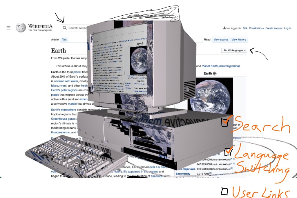
Over the past six months, the Web team at the Wikimedia Foundation has focused on two of the features we find crucial to improve the current desktop experience on our projects: search and switching between languages.
Search
There are currently 56,227,424 articles on all language editions of Wikipedia. Navigating this seemingly infinite landscape of information can be a challenge. The experience you have depends both on your intent, and the functionality of the site. Sometimes it’s the rabbit hole that draws people in — we all know the experience of beginning with a specific piece of information, a single article that sparked a curiosity and then magically spending hours clicking on blue links until we’ve accidentally learned about the moons of Neptune or the man who sold the eiffel tower (twice). Yet while the experience of getting lost can be exciting and illuminating, it is often not the goal of each knowledge seeker. Sometimes, there is a question in mind, or a time limit. Sometimes people are looking for specific information. This is where search comes in.
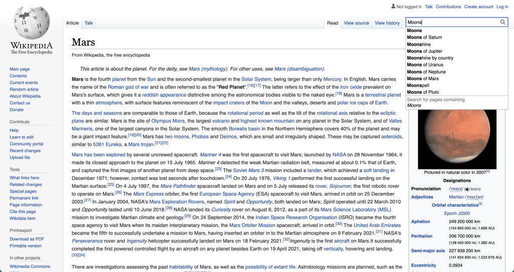
When we search we do so with intent. We are looking for a specific piece of information and, usually, we want to find it quickly. So, when our team was developing the new search experience for desktop, our goal was to make it easier and quicker for people to find the information they are looking for. Our previous search (shown below) deterred from this goal in two important ways.
Firstly, the search box itself was difficult to find. It was small and located in an unexpected location – the right top corner of the page. It did not follow the standards for search location set by many other websites, and thus became somewhat invisible to the average person.
Second, the search results only displayed a list of page titles, without any additional context or detail on what they could contain. This made it difficult to find the correct results, leading to a number of false positives (when unrelated pages were suggested) or sometimes, false negatives (when related pages were not suggested).
Our mission became simple. First, make search more noticeable. Then, make it easier to use.
To tackle the first issue we increased the size of the search box and moved it into the site header at the top of the page. This puts it in closer alignment with the URL bar, as well as the location people are familiar with from search sites like Google, DuckDuckGo, Yandex, and Baidu.
Then we focused on making it easier for users to find the search results they are looking for. This is done by increasing the context around searching – adding images and descriptions, as well as visual cues within the design that make it faster to find the correct results.
We are currently testing this version of the search across our various pilot wikis, and our preliminary results indicate a significant improvement to the search experience. Yet they are only the beginning. As with all of our other features, we will be continuing to iterate based on feedback from the wikis and the results of our qualitative tests.
Language Switching
Wikimedia projects are available in more than 300 languages. This is a core tenet of our movement. Many of our readers are multilingual and use our wikis to explore knowledge across different languages. Our editors, similarly, create content in multiple languages and/or translate content from one language to another. This allows the wikis to grow and share information and cultural context. It is vital to the existence of the Wikimedia movement.
However, despite the importance of multilingualism on our projects, it was not very clear how to switch between languages on the desktop interface. In 2020, we tested the desktop experience with a number of multilingual readers in India who were relatively new to Wikipedia and other Wikimedia sites. A majority of them did not know the information they were looking at was available in their language of choice. They also did not know how to find information in another language without leaving Wikipedia and using an external search engine. When we saw the difficulty users were having in these tests, improving the access to language switching functionality became a priority.
Currently languages are found in the sidebar of the site. Most wikis have many links in the sidebar and languages will show last, in the bottom corner. For certain wikis, they weren’t visible at all unless you had scrolled down the page. In short – they were difficult to find.
We decided to change this by giving languages a prominent location at the top of the page. Our early tests show that this allows people to find these links up to three times faster than before.
We are currently in the process of testing this change on our pilot wikis. We will be doing more qualitative research and quantitative testing as development of the projects continues. Our hope is that with these new features, not only will it be easier to switch languages on an article; all readers will have a better understanding of how the Wikimedia projects provide information in hundreds of languages.
Next Steps
Step by step, the desktop improvements project continues. We have several more improvements we’re still working on, as well as more conversations, research, and testing to do. We welcome feedback on the ideas presented above, as well as any others that might help in creating a more welcoming and intuitive interface for both readers and editors. If you have an account, you can also follow along with our changes as they come to you – just go to your Preferences page and uncheck the “legacy vector” option in the second (Appearance) tab.
Feel free to reach out to us with your thoughts in any language!
Can you help us translate this article?
In order for this article to reach as many people as possible we would like your help. Can you translate this article to get the message out?
Start translation