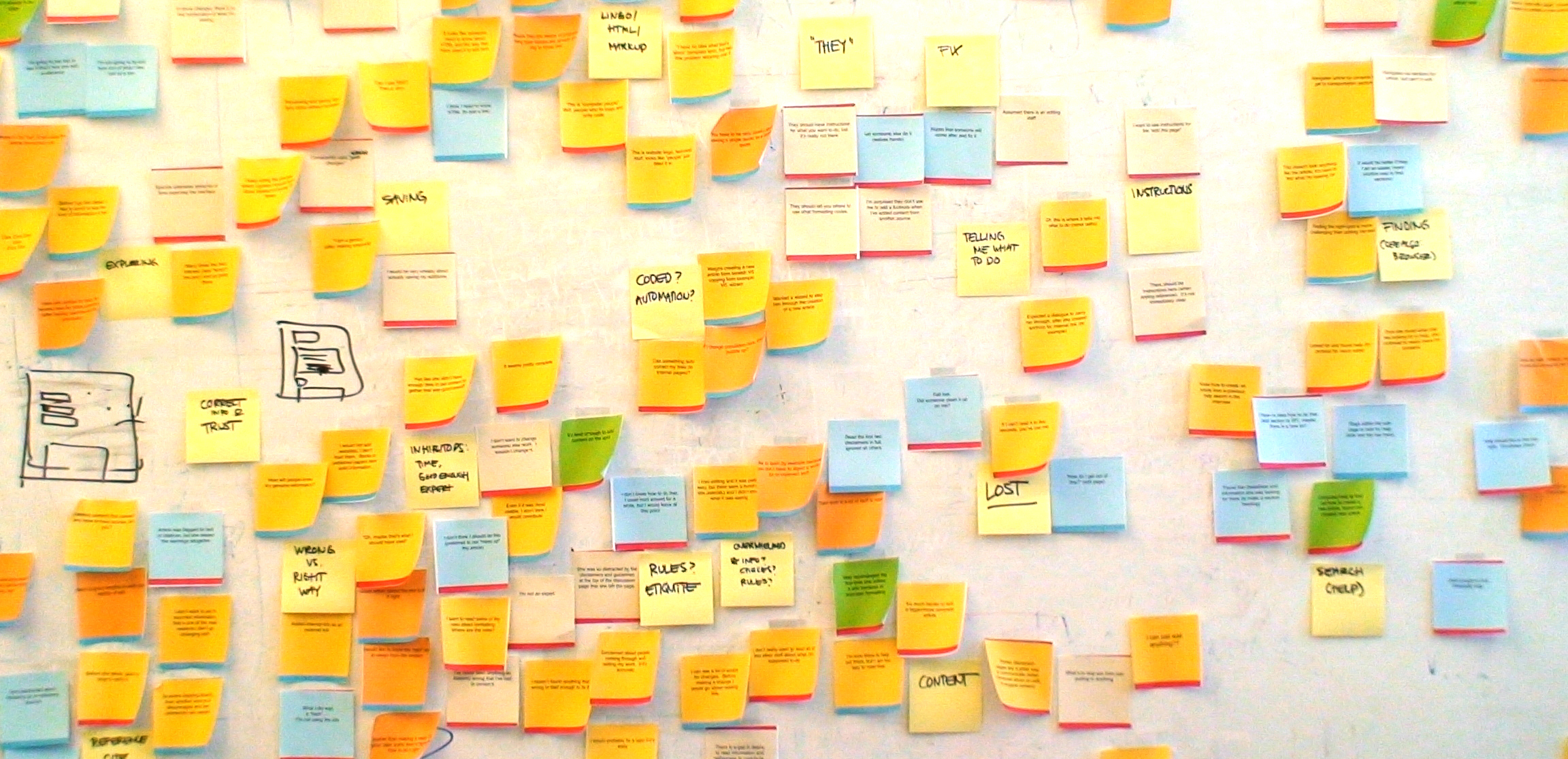
The Wikipedia Usability Team has finished up their analysis of the User Experience and Usability Testing conducted this past March with Bolt | Peters! As noted, please expect a full report on our project page soon. While we are getting all of our i’s dotted and t’s crossed, we wanted to share with you some of the major themes and findings & successes and failures.
Outstanding
“Usually it’s the most information in the easiest spot to access. It always looks very well put together….it boggles my mind how many people can contribute and it still looks like an encyclopedia.” – ‘Galen’
“I like Wikipedia because it’s plain text and nothing flashes” – ‘Claudia’
“It’s always one of the first hits on Google” – ‘Grace’
If there was one thing that was consistent and unanimous across our study participants, it was the assessment that Wikipedia is an incredibly valuable information resource whose accessibility is unparalleled. Aside from its value as a reference, a time and lifesaver, and an up to the minute news resource, participants also praised it’s simplicity, coherence, and breadth. Also, an extra thanks to Google, for showcasing just how referenced Wikipedia articles are – consistently making their links one of the top hits – our users count on that!
Room for Improvement
“Rather than making a mess, I’d rather take some time to figure out how to do it right.” – ‘Dan’
“Where are the rules?……I don’t really want to read all of this other stuff about what I”m supposed to do.” – ‘Grace’
All of our participants are Wikipedia readers, but had little or no experience with editing. Generally the editing process was not a warm and welcoming one. Before subjects even hit the ‘edit’ or ‘edit this page’ buttons, they voiced concerns about the rules, proper etiquette, formatting, and were naturally conscientious of and inhibited by maintaining the community expectations. When a few of them attempted to find answers to their questions about rules and etiquette, they were overwhelmed with the amount of information and documentation they encountered.
“ [I felt] kind of stupid.” – ‘Galen’
“It looks all jumbled and crazy…I’m going down to the stuff that looks like it makes sense.” – ‘Tito’
“I’m not a programmer. I know the letters PHP.” – ‘Seamus’
Once within the editing environment, most subjects commented on the illegibility of the hybrid Wiki syntax and article content – the more complex the article, the more exaggerated the response. When users made it past their initial reactions, navigating around the syntax to perform basic word processing tasks (correcting a typo, inserting a block of text, bold and italics formatting) proved less problematic than finding a particular section, adding references, using tables, creating and naming links. But not even our youngest and most computer savvy participants accomplished these tasks with ease.
“It’d be nice to have a GUI, so you could see what you’re editing. You’ve made these changes and you’re looking at it, and you don’t know how it’s going to look on the page. It’s a little clumsy to see how it’s going to look.” – ‘Bryan’
“On a blog it looks like the real page when you look at it. I have a hard time looking at this and going back to the way it actually is. I’m trying to correlate what’s on the real page.” – ‘Saurab’
Aside from feeling confused by the “code”, “computer lingo”, and “html”, subjects could not correlate what they were seeing within the edit box to what they saw on the article page. Most subjects opened a separate browser window to view the static article as they were making their changes and used preview and save before they had finished their work to monitor their editing progress and results.
Fail
“[This is] where I’d give up.” – ‘Shaun’
“ There sure is a lot of stuff to read.” – ‘Dan’
Yes, we can admit it. In some ways it seems, we are failing our users. The tasks that users most often failed to accomplish were adding references, creating a new article, and successfully finding help. When adding references, users questioned where and how to enter their sources. Once they established a location, they struggled with both the interface and the complex wiki syntax. Several users, while scanning pages to try to figure out how to create a new article, saw ‘create a book’ and thought “add a wiki page” was what they were looking for. In both adding references and new articles, some users consulted help. Help proved to be quite a labyrinth, where the cheat sheet was one source of shining light.
Check out this highlight video (in English only for now) on Commons:
Editing Wikipedia Makes Me Feel Stupid
Explain the Editing Process to Me
I Can’t Tell What This Really Looks Like
Though we cannot tackle the full scope of issues that our study participants brought up, brought to our attention, and validated, it was an eye-opening and learning experience for the whole team. The study informs us as we take a further look at the most effective changes we can make to lower these barriers for potential Wikipedia editors. We look forward to sharing our complete report and initial ideas with you – stay tuned!
Parul, Wikimedia Usability Initiative

Can you help us translate this article?
In order for this article to reach as many people as possible we would like your help. Can you translate this article to get the message out?
Start translation