Wikimedia Data Analyst Erik Zachte recently unveiled a new interactive visualization showing the global distribution of edits for various language editions of Wikipedia.
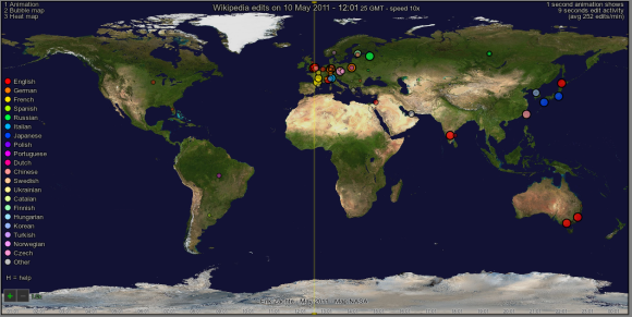
This first version allows users to see where edits are coming from for a given day. Right now, the day is fixed but fairly recent.
You can control the parameters of this interactive visualization by using keyboard shortcuts available in a “Help” menu (press ‘H’). For example, ‘E’ switches between different event markers.

The data behind these graphics comes from our Squid logs, that usually record about 400,000 edits a day. See Erik’s post to read more about how the visualizations were made.
By zooming on a particular area (‘+’ or mouse scroll), or filtering the edits by language (‘N’ or space bar), interesting things can surface. For example, bubble maps and heat maps reflect densely populated areas with easy Internet access.

Three types of displays are available, all showing the spatial distribution of edits over time in a different way: an accelerated animation of edits over a day (‘1’), a bubble map of the same edits over a day (‘2’), and a heat map of edits over a day (‘3’).
The animation over the course of the day also shows the levels of activity depending on the time it is in various timezones. Compare for example the activity of the Spanish Wikipedia in Spain and Latin America over the course of the day.

Similarly, the map shows that most edits to the Chinese Wikipedia are made from outside of mainland China (Hong Kong and Taiwan):

Open the visualization and play with it yourself!
In the tradition of free software that Wikimedia is attached to, this visualization was entirely created using HTML5 (canvas) and JavaScript, and no proprietary tool is necessary to view the animation.
The visualization works in the most recent browsers. If for some reason it doesn’t work for you, below is a short video to give you an overview of what it looks like when animated.
[vimeo 24020104 w=700 h=394]
The video is also available on Wikimedia Commons, along with more screenshots.
—
Guillaume Paumier
Can you help us translate this article?
In order for this article to reach as many people as possible we would like your help. Can you translate this article to get the message out?
Start translation