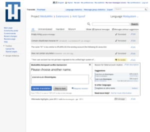
User testing is essential for designing multilingual interfaces, even though it can be a time-consuming process: it ensures that the community of users are part of the design process. In this article, we share lessons learned by the Language Engineering team while designing features and interfaces that empower users to read and edit Wikipedia and its sister sites in many languages.
Designing user interfaces for the Wikimedia world comes with a lot of responsibility. To achieve our mission, we need to make sure we think of users with varying levels of technological expertise and language skills. While the internet can be a very friendly place for those who understand English, it could be like navigating the Greek Wikipedia to the 4.4 billion people who do not.
While designing the user interface (UI) for language tools like the Universal Language Selector (ULS) and Translate extension, we needed to make sure it could be understood and used by those who use the internet in languages other than English. We had to create early representations of the interface, link them together to create interactive prototypes and test them with users. Each of these steps presents various challenges in a multilingual environment.
Design tools generally have poor support for non-Latin scripts. Moreover, creating screens and prototypes in languages that you don’t speak is hard. But since the world needs these language tools, we can’t wait for our design software to improve, we just need to figure out our own ways to get things done.
Creating multilingual mock-ups
UI designers make layout comps early in the process to illustrate how the interface elements and content will be arranged.
While designing the ULS (that will display a massive list of languages), the only way to understand the effectiveness of the layout was to simulate the end result with all the language names. Common graphic design suites are not optimized to manage large number of text elements and have issues when working with non-Latin fonts.
Our workaround: After some exploration, we realized that the most painless way of creating comps that have multilingual text is to render them outside the design software:
- Create the UI layout using your design tool;
- Use a template language like mustache to include placeholder text within the mockup and export them as SVGs;
- Create a translation text file to replace the placeholder text with strings in your language;
- Perform a string replace in the SVG and rasterize it with inkscape using a script.
There is a neat illustration of the entire process in this video by Pau Giner. This process allowed us to quickly experiment and test comps in many languages by giving the text file to a translator.
Making interactive prototypes
The best way to understand if a design is effective is to observe a user using it. The fastest way to do this is to make click-through prototypes that simulate a workflow. When our multilingual comps were ready, the next task was to package them and link them by hotspots. Most of the popular tools to do this are not free. After scouting around for free alternatives, we chose a Firefox extension called Pencil because it:

- imports raster and vector images, including copy-pasting from other design tools;
- features master pages and a component library to reuse graphic elements;
- has rich text support;
- exports to a single HTML which simulates a web page experience;
- is free and open-source.
It fulfills our requirements, even though there are a few annoying quirks in the interface which could be improved. Check out this interactive presentation of the ULS that was created using Pencil.
Remote user testing
Once our prototypes are ready, it’s finally time for the real test, with users from parts of the world where the primary language is not English (roughly 95 percent of the world’s population). Planning the logistics and schedule of remote user testing can be tricky, so here are a few key points to keep in mind:

- Create a pool of volunteer user testers early in the design process. Getting a tester is usually a hit and miss, so it helps to have a volunteer base that can be easily reached when needed.
- Tell users what the test is about. Most users will not know what happens in a user testing session and may be afraid to volunteer. Who likes to be tested anyway? We created this guide to better communicate what the sessions were about.
- Schedule the tests initially and ask for a confirmation. We found that testers may not be available at the scheduled time and they often want to reschedule. Stay friendly and accommodating, as these people are providing you with valuable feedback.
- Observe using a platform that meets your requirements. We found Google+ Hangouts to be the service of choice due to its ease of use across operating systems. As a bonus, it can automatically create a YouTube video of the whole session.
- Inform the tester beforehand on privacy issues. If you want to share the observations publicly, make sure the tester knows and has agreed to those terms.
- Have fun. Keeping the mood light with initial introductions will help to make the tester feel comfortable and give more feedback.
If you are curious, you can watch this video from our latest test sessions of the ULS to understand how we do it.
We are designing and developing your software, so keep the feedback coming!
Arun Ganesh and Pau Giner
UI/UX Designers, Language Engineering Team

Can you help us translate this article?
In order for this article to reach as many people as possible we would like your help. Can you translate this article to get the message out?
Start translation