Skip to content
Diff

Diff

  • Categories
    • Equity & Inclusion
    • Education & Open Access
    • Technology
    • Partnerships & Events
    • Policy & Advocacy
    • Movement Strategy
  • About
  • Submit
  • Calendar

Try the new login and account creation on Wikimedia projects

25 April 2013 by Steven Walling
Translate This Post

An account creation and login process that is simple and pleasurable to use is a must-have for engaging more contributors to Wikimedia projects. On just Wikipedia’s English-language version, more than 3,000 people sign up for an account on an average day. These interfaces are often the first time a new editor interacts with the site, beyond consuming content.
We’re happy to announce that, starting today, users of all Wikimedia projects will be able to try a new look for our account creation and login. For about a week, we’re asking all Wikimedia volunteer editors to give the update a try and help us spot any nagging bugs or errors in translation. We’ll then enable the new forms as the default on all our wikis.
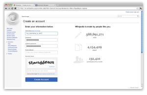
The new account creation (mockup)

Help test the new forms

If you’re a current or prospective member of a Wikimedia community, we need your help. Please give the new interfaces a try, report bugs, or leave comments for us on your wiki’s preferred noticeboard.
We’re providing this week-long testing period–instead of simply rolling out the new interface with less advance notice–to get help making sure our localizations are correct and the interfaces will be bug free for the 800 or so wiki communities we support.

  • See the new account creation form
  • See the new login form

Both links above are to our largest and most active community, English Wikipedia, but if you’re a contributor to any other project, you can try out the new forms by simply appending &useNew=1 to either URL on your favorite wiki. You can also find more detailed, step-by-step testing instructions if you’re willing to go a little deeper with testing the forms.

How we got here
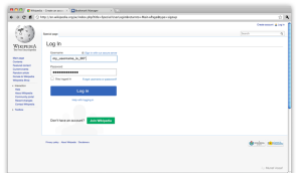
The new login (mockup)

The Wikimedia Foundation’s Editor Engagement Experiments team has been optimizing these forms, using weekly controlled tests to measure the impact of our new signup form and iterate on our ideas. (See our original announcement.)
Overall, the results of these experiments were encouraging. Using English Wikipedia as our proving ground, our most successful experiment gained around 800 additional signups over a two week period. The relative increase in conversion was 4 percent, from 28 percent to 32 percent of users successfully creating an account after visiting the signup page. The total number of new users gained will change based on seasonal trends. We also decreased the number of errors which held up users after they submitted the form by 14 percent.
This interface redesign marks the first time MediaWiki core (the platform shared by all our projects) is using the new form styles that we have experimented with in account creation, our new onboarding experience for Wikipedia editors, and in other features. The patterns we’re introducing via the new account creation and login, codenamed “Agora” by the Wikimedia Foundation design team, will now be able to be reused in a more standardized way by MediaWiki developers.
The redesigns we’re introducing to login and account creation are hardly radical. Simple use of typography, color and vertically-aligned form fields are not what could be called bold innovation in design. Nonetheless, we’re extremely happy to be releasing an experience that will make signing up and logging in less of a burden for the many contributors to Wikimedia communities, and thus enable them to create great, free educational resources.
Steven Walling,
Associate Product Manager

Archive notice: This is an archived post from blog.wikimedia.org, which operated under different editorial and content guidelines than Diff.

Can you help us translate this article?

In order for this article to reach as many people as possible we would like your help. Can you translate this article to get the message out?

Start translation

Related

37 Comments
Inline Feedbacks
View all comments

Tomasz
9 years ago
#19773

Two questions off the top of my head:
1) What will happen after the end of the testing period? Will this layout be introduced for good?
2) Can we please introduce an &useOld parameter so that people who dislike the new design (like me) can use the old one? I’d hate to have to log in using the new layout.

0
Steven Walling
Reply to  Tomasz
9 years ago
#19774

Quick answers:
1). Yes, when ready these will be the new defaults. This is dependent on no new critical bugs and complete localizations.
2). No, we will not be providing opt outs. Maintaining multiple old versions of these forms is untenable for everyone in the long term.
Best regards,
Steven

0
Tomasz
9 years ago
#19775

I am afraid that the new login page sucks when compared to the current page; I don’t know why you decided to leave so much space to the right of the login form.
I mean, I know—to be more mobile-friendly, but this definitely does not look nice on desktop.

0
Steven Walling
9 years ago
#19776

Tomasz,
“Sucks” is not a constructive piece of feedback. It would help if you just focus on problems that can be acted on, like the whitespace issue. Other people have brought that up, so we’ll work it out. I believe there’s a relevant bug I’ll make sure you’re CC’d on if you’re not already.

0
trazeris
9 years ago
#19777

Good, these pages were in dire need of a redesign.
The account creation form is only partly localized on the French version.
Also the point of the Reason field is not clearly explained when we are already logged in. Maybe a placeholder text would do the trick.

0
S Page
9 years ago
#19778

trazeris, the localizations from hard-working translators should roll in over the next several days. A placeholder for “Reason” is a good idea, note that field isn’t explained in the old form either. There are many things we could do to make the form clearer for the case of a logged-in user creating an account, but I wonder how often that happens.

0
Nicolas
9 years ago
#19779

There should be a way of enabling registration using OAuth, OpenID, Facebook, Twitter etc.

0
Steven Walling
Reply to  Nicolas
9 years ago
#19783

OAuth and OpenID are actually being worked on separately by Operations. See: https://www.mediawiki.org/wiki/OpenID
As far as social login (e.g. Facebook, Twitter, etc.) we’re extremely unlikely to ever do this. We take privacy very seriously, and aren’t comfortable sharing data about who Wikipedia editors are with for-profit social networks, many of whom have rather dubious records when it comes to user privacy and data handling.

0
bennylin
9 years ago
#19780

I second OpenID

0
wrk3
9 years ago
#19781

My instant impression of the blue Login button was that the page uses Facebook for login, even though the form doesn’t mention “Use Facebook.” Perhaps a different color could be used to avoid giving this impression? This could be off-putting for those like me who don’t use Facebook login.

0
Steven Walling
Reply to  wrk3
9 years ago
#19782

Blue is actually not exclusively a Facebook color. Considering that the action logs users in, or throws an error if you try to enter your Facebook credentials (you can’t log in with email, obviously), users will get the message I think.

0
Ho Tuan Kiet
9 years ago
#19784

Can you make the numbers in the sign up page live?

0
Steven Walling
Reply to  Ho Tuan Kiet
9 years ago
#19788

Not a bad idea at all. The numbers do refresh automatically on new page loads, but making them counters would be nice. I’ll investigate doing that.
Thanks!

0
Mark
9 years ago
#19785

I’ll second that the Reason field doesn’t make sense to a new user. I’m not sure why it’s there or what it means. Do I write the Reason I want an account? The reason I chose the email address in the field above?
Text between signup fields is okay. If the usability projects aim at having more long-term slightly less tech-savvy users (Visual Editor etc..) then a more conversational sign up process + explanation would be better than a challenging sea of textareas.
But great direction to head in! .. And white space is fine. It’s calming.

0
Steven Walling
Reply to  Mark
9 years ago
#19787

Hey Mark,
The reason field only appears if you’re already logged in. It’s for people who fulfill account creation requests, for those make a request because they can’t fill out the form themselves for accessibility reasons or because of other issues.
Thanks for the feedback. 🙂

0
Bron
9 years ago
#19786

I think the new login is much better for desktop users. Keep it simple. Thumbs up for working towards mobile users, but on my samsung galaxy s3 it doesn’t fare so well just yet. See the screenshot below. Not sure if it is partly a settings problem on my behalf, but you should be aware of what many android users may be looking at. [[File:Screenshot 2013-04-28-09-10-41 1.png|thumb|Test new login page for wikipedia.]] http://commons.wikimedia.org/wiki/File:Screenshot_2013-04-28-09-10-41_1.png Agree with above re: reason button. Needs explanation, i.e. “Wikipedia has detected you are already logged in to an account on this computer. What is the reason… Read more »

0
Steven Walling
Reply to  Bron
9 years ago
#19790

Hey Bron,
Quite right about mobile. Unfortunately our mobile skin, which includes a mobile-friendly version of login and account creation, is not yet enabled on Commons. I’ll try to figure out what the story is.

0
Pete Forsyth
9 years ago
#19789

Even so, if I were creating an account for somebody else, the word “reason” wouldn’t be enough for me to know what is being asked for. I think another couple words are needed here.

0
Kippelboy
9 years ago
#19791

I agree with Pete’s comment. The “reason” box could be a little more clear with a longer sentence. Good job, btw! 🙂

0
Numbermaniac
9 years ago
#19792

It looks brilliant! It will be able to use terms such as &returnto=, correct? And can it do that for now, when I click try the new login form?

0
Steven Walling
Reply to  Numbermaniac
9 years ago
#19793

Yep, returnto and other parameters will work just like normal.

0
ProtoDrake
9 years ago
#19794

Looks fine, and seems a little more user friendly than the previous set-up.

0
Hires an editor
9 years ago
#19795

The “login” button – I couldn’t find it, because it was unusual in its size and placement. Make it more normal, and more like regular web forms most people are used to seeing elsewhere on the internet…

0
Anand
9 years ago
#19796

Suggestions –
* The login username should be made case insensitive.
* After login, we don’t return to the page we were on.

0
Guy Macon
9 years ago
#19797

Just tried the login, looks great and works fine on my 1920×1080 screen, full screen and in a small window. I like the layout. I disagree with the comment that having it narrow and to the left is somehow undesirable. It was clearly designed to avoid horizontal scrolling, which is a big win. Tried both http and https versions. Both work fine, and (this is important) both look identical. My login may have tested something that few logins test; I have a 64 character password. This caused no problems; at my screen resolution and text size it shows 33 black… Read more »

0
Fitoschido
9 years ago
#19798

Please remove the super-tired blue glow around focused text boxes. I hate seeing it all over the Internet thanks to Twitter Bootstrap!

0
Steven Walling
Reply to  Fitoschido
9 years ago
#19801

Do you have a reason why it is not advantageous, beyond the fact that it is common?

0
User:Kevjonesin
9 years ago
#19799

I interacted with the new log in page today. The blue field combined with a white sans-serif font of the “Log in” button immediately brought [[facebook]] to mind. It caused me to hesitate and consider going back to the old login page as I was initially unsure as to whether I would be initiating an unwanted interaction with an external page (facebook). –Kevjonesin

0
User:Kevjonesin
9 years ago
#19800

Expecting users to have to “get the message” seems contrary to “an account creation and login process that is simple and pleasurable to use”. IMHO, I think the shade of blue field combined with a white sans-serif font will bring ‘facebook’ to mind for many (if not most) users. The ‘facebook’ logo has become a cultural icon and is parodied in many forms. Seems trivial to simply choose another color scheme which doesn’t attract such confusion. Unless one has come to invest [[WP:OWNERSHIP]] (ego) in that particular design element of course. Or is trying to make a [[WP:POINT]] about not… Read more »

0
Steven Walling
Reply to  User:Kevjonesin
9 years ago
#19802

Hi Kevjonesin, If my response seemed flippant let me rephrase: we don’t just expect users to get the message based on our assumptions about the design. This kind of issue is precisely why we ran multiple controlled, randomized tests of the new form’s style on account creation. The results of those tests were that, in every version where this large, blue button style was present, signup rates increased compared to the previous version. If the theory is that users would not know which website they’re on because of this button, there are also other prominent brand elements of Wikipedia still… Read more »

0
anjuagarwal
9 years ago
#19803

I have tried a lot you must log in at the email given

0
G.B.CHANDA
9 years ago
#19804

I was given this website :
http://www.en.wikipedia.org/wiki/user_talk:G.B.CHANDA
I opened an account as: G.B.CHANDA . I am unable to open the page.
{{ Help }}
gabriel.chanda@unza.zm

0
Blaisorblade
9 years ago
#19805

Actually I got the same impression – the Log in button looks very much the same as Facebook somehow, maybe because that’s the Facebook theme color (but I’m not sure). However, I couldn’t say what’s Wikipedia theme color, otherwise I would suggest it for the button. Also, why does the other button have that weird green color?

0
obaji onyekachi
9 years ago
#19806

I WANT TO SIGN AND IS NT GOING

0
Rags
9 years ago
#19807

Thank you for accepting comments from a user not logged in. I want to jump on the bandwagon, here. I am no longer active on enWP, but only due to hardware issues. Facebook, however, i DETEST. There is a small but growing cadre of us, and if I didn’t have confidence in the integrity of the mgt at Wikimedia Foundation, I would steer clear of logging in solely on the basis of visual similarity. I was heartened by Steven Walling’s statement, above, “…extremely unlikely…for-profit social media…dubious record…” Amen, and amen.

0
Rags
9 years ago
#19808

You have my permission to delete my previous remarks: I can see that my intention may not be clear, partly due to the punctuation not showing. You can tell, I think, that I have a problem with Facebook. I understand the attraction, driven by controlled experimental results, of riding coattails to greater onboard stats, but I think this strategy may come back to bite, longterm. Wikiculture is DIFFERENT. BE different. Viva la differance!

0
williammeyer
9 years ago
#19809

youhave amistakein yourbiogofallison steele. Ceil loman was a personality on the tedsteeleshowon WOR chan 9 NY in the 50’s. Ted
divorced allison and married Ceil

0

Meta

Posted in Editor engagement, Editor Retention, WikimediaTagged account creation, login, redesign, Wikimedia Blog (EN Archive)

Related

Welcome to Diff

Welcome to Diff, a community blog by – and for – the Wikimedia movement. Join Diff today to share stories from your community and comment on articles. We want to hear your voice!

Learn more

Subscribe to Diff via Email

Enter your email address to subscribe to Diff and receive notifications of new posts by email.

Wikimedia News

Wikimedia Foundation News

  • Wikipedia’s new sound logo: Winner of The Sound of All Human Knowledge contest announced
    28 March 2023 by Wikimedia Foundation

Wikimedia Technology Blog

  • From hell to HTML: releasing a Python package to easily work with Wikimedia HTML dumps
    24 February 2023 by Martin Gerlach, Isaac Johnson and Nazia Tasnim

Down the Rabbit Hole

  • 2022 as you saw it on Wikipedia
    15 December 2022 by Ed Erhart

Diff

This is Diff, a Wikimedia community blog.

All participants are responsible for building a place that is welcoming and friendly to everyone. Learn more about Diff.

A Wikimedia Foundation Project

Links

  • Join
  • Subscribe
  • Guidelines
  • Editorial guidelines
  • Privacy Policy
  • Terms of Use
Log in

Content licensed under Creative Commons Attribution-ShareAlike 3.0 (CC-BY-SA) unless otherwise noted.
Powered by WordPress.com VIP, Automattic Privacy Notice.

wpDiscuz
 Report this comment
You are going to send email to

Move Comment