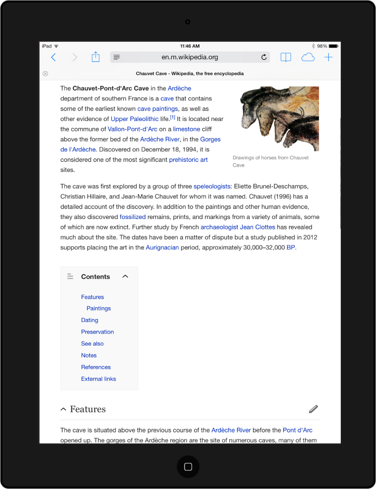
Tablet users, rejoice! The Wikimedia Mobile Web team has been working to optimize the mobile view of all our projects, so that reading, browsing, and editing content are all easier on mobile touch screens of any size. Now our changes are finally live on tablets, too!
Why a new tablet view?
Wikipedia and its sister sites were designed long before the rapid growth of smartphones and tablets. For the past two years, we’ve worked to improve the reading and editing experience for smartphone users, and now we’ve turned our attention to tablets. If you’ve used Wikipedia on your phone, you may recognize similarities in the new tablet view. But we’ve also departed from the smartphone experience in some ways, in order to create a tablet-specific experience.
Just the features you need, designed the way you need them
- Typography and layout. We’ve increased the font size and narrowed the width of the content area to improve readability. These changes are responsive, too, so it looks great whether you’re on a tablet, a phablet – or even the mobile site on your desktop computer.
- Table of contents and sections. Get to the section you need quicker, but don’t be afraid to lose yourself in the content once you’re there. We’ve taken advantage of the larger screen space that tablets provide and kept article sections open to encourage long-form reading.
- Last modified byline. Wikipedia is never finished. Getting more readers to see that our content is constantly growing and evolving is a big priority for us. Now you can see at a glance which articles have been edited recently, and which could use some love from contributors like you…
- Editing. See a typo? Fix it! Simple formatting options and mobile-friendly linking to pages or references are coming soon for all tablet users, and starting this Thursday you can get a preview of this functionality now by opting into our experimental beta site (look for Settings in the site menu and tap to turn on Beta).
- Other features. The contribution features you know and love, optimized for tablets: uploads, watchlist, page history, notifications, and more.
Your tablet, your choice
If you don’t want to leave the old desktop experience, fear not. You can switch between the desktop view and mobile view from any page by scrolling to the bottom and tapping the “Desktop” or “Mobile” links.
How can I give feedback?
We’re excited to hear from you about these changes! Leave us a comment here and let us know what you think.
Maryana Pinchuk, Product Manager, Mobile

Can you help us translate this article?
In order for this article to reach as many people as possible we would like your help. Can you translate this article to get the message out?
Start translation
