
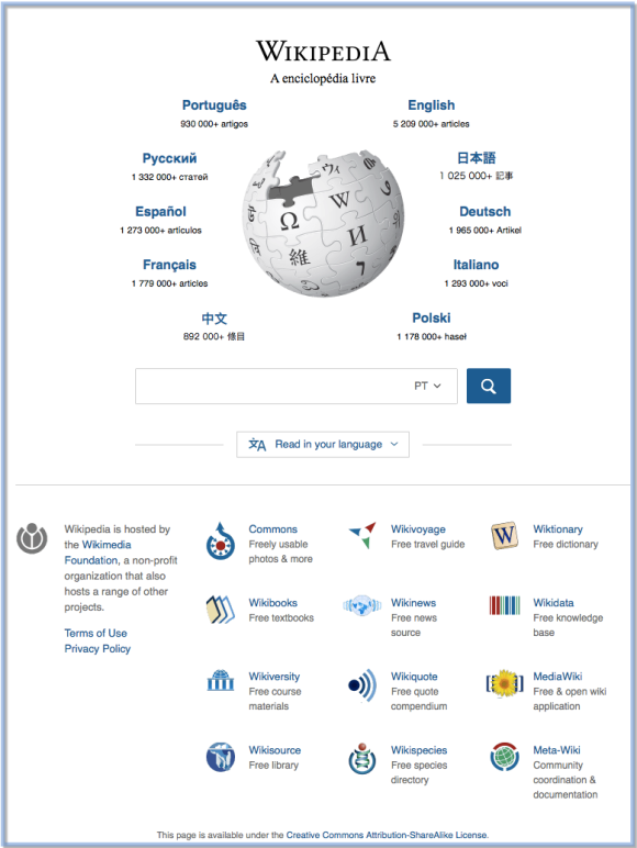
Everyone who uses the Wikipedia.org portal is familiar with the look of the page: a beautiful puzzle globe encircled by the top ten viewed languages; a long list with Wikipedias in hundreds of languages that can all be read and explored; the search box that can make queries in nearly any language; and a compilation of related Wikimedia projects.
Over the last eight months, the Wikimedia Foundation’s Portal team, part of the Discovery department, has been busy improving the discoverability of information within the portal to make it more contemporary and easier to use.
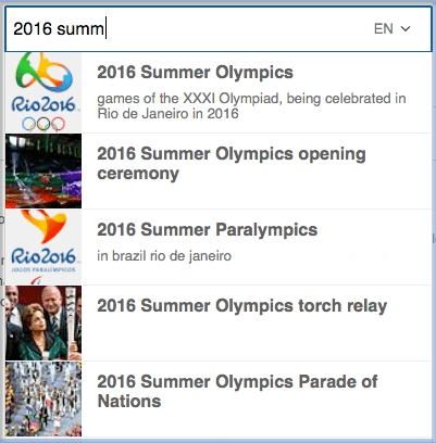
To start, we’ve updated the search box. When you are entering a query, you will now see images and metadata that correspond to your search, and you’re also free change the search language without leaving the page.
We’ve also optimized the portal site, making it load faster by utilizing smaller sized images and streamlining the page code.
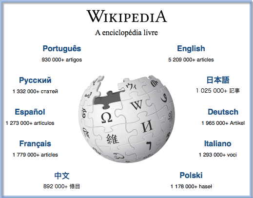
A fairly inconspicuous change to the page will immediately detect your browser’s preferred (or default) language and rearrange the top ten links to display those languages first, along with the remaining top ten viewed wiki’s by language, around the globe.
In this example, The Free Encyclopedia is displayed in Portuguese, since it is the browser’s first preferred language and English is the second.
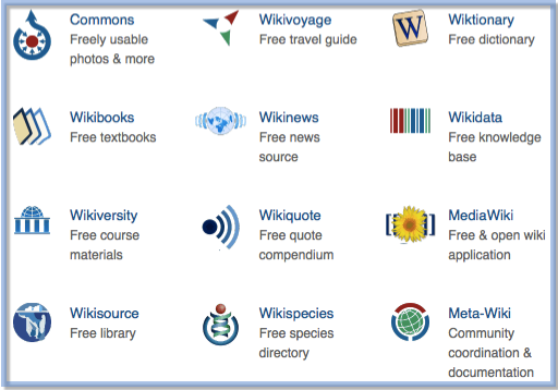
We’ve also added sister project descriptions, located in the page’s footer, which will hopefully spark curiosity as to what a person might find when they visit those individual projects.
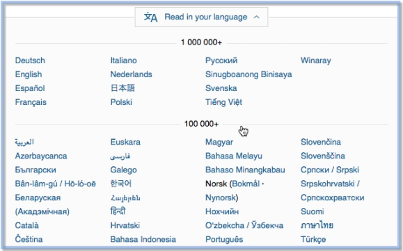
The look and feel of the long list of every available language wiki (sorted by article count) has been modernized and placed inside an elegant drop down. This new feature makes finding your language wiki a bit easier on the eyes as well as providing easy access on any device.
We hope you enjoy using the new portal page! You can view a short video that shows some of these new features.
And, if you don’t quite remember what the old Wikipedia portal site looked like before we made any changes, here’s a reminder.
Deborah Tankersley, Product Manager, Discovery
Wikimedia Foundation

Can you help us translate this article?
In order for this article to reach as many people as possible we would like your help. Can you translate this article to get the message out?
Start translation