Translation is a key workflow for content creation in many wikis. Content translation has already helped editors create more than 250,000 Wikipedia articles. Not only experienced editors and expert translators have become more productive with the tool, but it has also reduced the barrier to entry for new editors.
Although content translation is currently used by many users, the tool is still provided as a beta feature, and there are still many aspects to polish. In particular, we wanted to tackle some pending work accumulated over time around consistency of the visual style, simplification of key workflows, and support for small screens and touch devices.
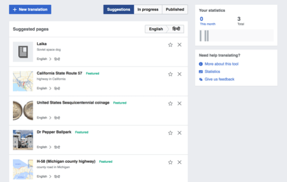
The arrival of a new member to the Global Collaboration team was a good opportunity to deal with this design debt. Petar Petković started as an intern in June 2017 and has been leading the development efforts with the collaboration of other members of the team as well as people from other teams at the Wikimedia Foundation.
More consistent visual style
We wanted to update the visual style of content translation in order to better align with the Wikimedia design style guide. The style guide is an effort started by the Wikimedia design team, aimed at helping designers and developers across the Wikimedia movement to create more consistent products. The style guide is still in its early stages, and we welcome interested people to get involved and contribute to the style guide repository.
Although the style guide is far from complete, we wanted to start applying some of the style guide’s initial concepts to existing products in order to learn more about how utilizing the style guide’s principles works in practice.
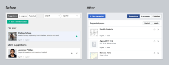
Content translation has been updated to make use of the colors defined by the Wikimedia style guide color palette. This not only brings visual consistency but helps to achieve a higher degree of accessibility, since colors in the palette were chosen to provide a high level of contrast. In addition, spacing, layering, icons and UI controls were updated to provide a more clear and consistent experience.
As a result, the information in the content translation dashboard is now more pleasant to read, even under sub-optimal light conditions or for those with sight issues. The content translation dashboard is also more consistent visually with some of the new Wikimedia projects, including the different mobile products.
Simplifying key workflows
Picking an article to translate is a key step in the translation process. From early user research sessions we learned that users are motivated by working on topics that interest them, and by the impact their translations can make for readers. In addition, we knew that making the process more fluent would lower the barrier to start more translations.
Our initial dialog for starting a translation was a basic form that did not consider many of the above aspects. We redesigned the process to both simplify it and better guide the user.
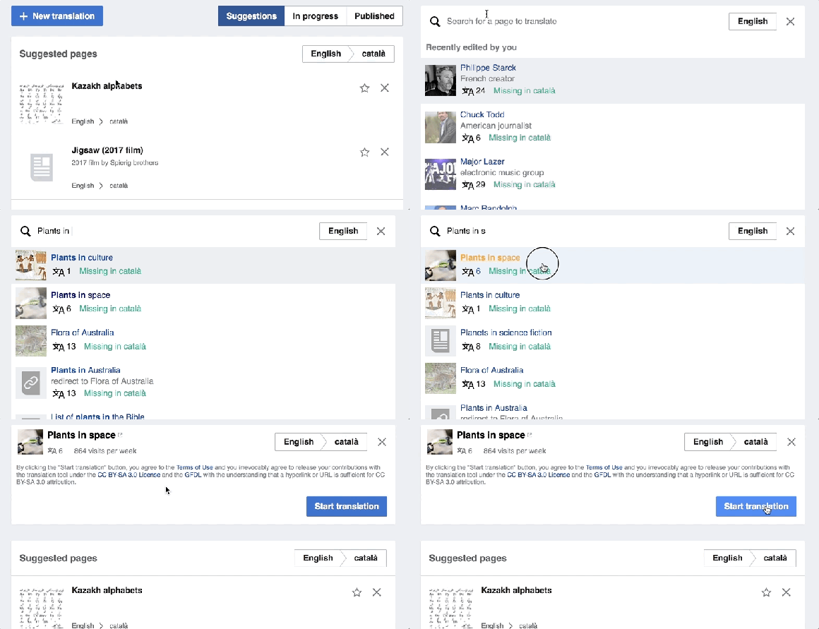
In the new process, we surface articles that the user recently edited, since the user may be interested in translating them. We also indicate the number of languages in which the articles are available and the number of views the article receives. These are two indicators of the relevance of the topic and the potential impact a translation may have.
The selection of an article is now more guided, providing clear visual cues for each stage of the process. In addition, the amount of information to be provided by the user has been reduced to make the process more fluent. Users can quickly search for an article to translate rather than feeling like they are filling out an elaborate form.
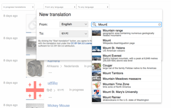
Image via Commons, license.
Finally, the main action to create a new translation is now shown as the most prominent action in the translation dashboard. This has resulted in the rearrangement of the view controls and the language selectors leading to a clearer visual hierarchy.
Supporting small screens and touch devices
Content translation was designed to support the current translation process of Wikipedia articles. Since this process requires heavy text input and consulting multiple information pieces, it has not been optimised for mobile devices.
While we were not aiming at supporting a full mobile experience with this design refresh, we have been identifying several smaller areas that could make life better for those translators using small screens and touch devices. For example, those using a low resolution laptop with a trackpad or even a tablet.
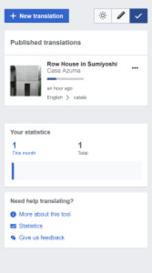
Following a responsive design approach, the translation dashboard now makes better use of the available space. Information panels get rearranged and controls such as the language or view selectors get compacted or expanded depending on the screen size. We also corrected the few instances where the only way to perform an action required using hover or accessing an element with a small active area, which limited the use of touch interactions.
Next steps
Most of this work has been focused on the translation dashboard of content translation, which is the main view to pick articles to translate, and manage your existing translations. The main translation view where users translate the content of an article can also benefit from a similar intervention, and we have identified aspects to adjust on it next.
Feel free to provide your feedback about the improvements on content translation in the project talk page, as well as making any proposal for the more general efforts on the design style guide.
Pau Giner, Senior User Experience Designer, Audiences Design
Wikimedia Foundation
Can you help us translate this article?
In order for this article to reach as many people as possible we would like your help. Can you translate this article to get the message out?
Start translation