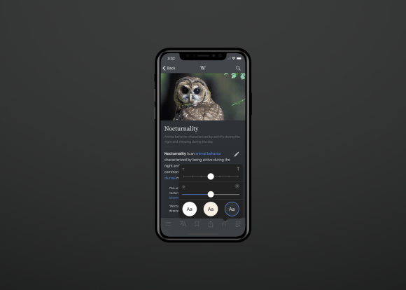
Over the past year, people using the Wikipedia iOS app have repeatedly told us that they wanted a night-time reading mode so they could read Wikipedia in the dark.
The story often went like this: “I love to explore corners of Wikipedia, but the screen is too bright and my nightly read-a-thons are keeping my partner awake.”
Beyond the requests—the many, many requests—building the nighttime reading mode feature aligned with our recent efforts to make the iOS app more accessible for users with visual impairments. Last year, we added VoiceOver, which allows users to navigate Wikipedia by voice, as well as Dynamic Type support, which allows users to control the text size across the app. Adding a nighttime mode would help as well for users with color sensitivities (such as to blue light) to read more comfortably.
Here’s what we did.
Designing “night-time reading mode.”
Over the past year, designers across the Wikimedia Foundation have been working together to develop the Wikimedia style guide, an ongoing and collaborative project which aims to bring consistency across the Foundation’s many projects.
When the iOS team began thinking about what colors would go into the “nighttime reading mode” experience for readers and creating new color palettes that support comfortable reading in a variety of light settings, we started by building off of the existing colors in the WMF color palette. The colors in our “dark reading mode palette” were developed collaboratively by the Reading team’s designers and are extensions of the colors in the Wikimedia Foundation’s style guide. WMF colors became the anchors for the secondary palettes, with an emphasis on WCAG conformance and accessibility.
Engineering and design working
The iOS engineering team works closely with the design team throughout all stages of feature design. By defining the problem together—and coming up with a shared language—we’re able to clearly communicate technical restrictions to the design team, which helps inform a technical solution that’s potentially easier to implement. Hearing design’s approach also helps shape our early technical decisionmaking and sets us up for success.
In using this process for our “dark mode” reading themes, we were able to distill every color used in the app into a set of named colors. This was our shared language for discussing changes, which helped with rapid iteration by making it easier to clearly identify what color or set of colors was incorrect in a given screenshot. It also helped pave the way for implementing another highly requested feature—Sepia mode. With the palette already defined, adding another theme was an easy win.
What we heard and what’s next
The feedback from users has been tremendous. Users gave this version our highest star rating ever. MacRumors and other Apple tech sites ran positive reviews about the update and Apple featured it in their “Best App Updates” collection. Dark theme is especially popular, with two-thirds of users choosing that theme.
And as we continue to improve the app, we’ll be making sure it stays accessible.
If you want to help the team continue making a great app together, we always need beta testers. You can sign up here. You can also help write code or join the mobile-l mailing list for updates on new versions and features.
Josh Minor, Senior Product Manager, Reading Product
Joe Walsh, Software Engineer, Mobile Apps
Carolyn Li-Madeo, User Experience Designer, Audiences Design
Wikimedia Foundation

Can you help us translate this article?
In order for this article to reach as many people as possible we would like your help. Can you translate this article to get the message out?
Start translation