
Wikidata is the central knowledge repository in the Wikimedia universe that now encompasses more than 300 free, online encyclopedias, and more than 800 projects in total. Why would anyone devoted to the representation of the sum of knowledge—which by its complexity must encompass different perspectives, interpretations, points of view—need a central repository like that? Simply because knowledge demands grounding in both logical and empirical truths, a set of constraints that define the limits of its power and usage.
While we can find ourselves engaged in an elaborate debate on whether the theory of relativity provides an adequate description of the physical universe or not, we should not engage in the debate on whether it was or not created by Albert Einstein and published in Die Grundlage der allgemeinen Relativitaetstheorie in 1916 if we can claim these facts with a descent degree of certainty and under a broad consensus. Whatever language we use to express knowledge, in any culture, and to any audience, we should not question whether Berlin is a city, and a capital of Germany, while it is also a city in North Dakota, a fact of which Wikidata is well aware of, as well as a name of an American synthpop band who authored the famous “Take My Breath Away“.
Wikidata thus documents the things that exit, real or not, the facts about them, and the relations that connect them, in a huge network of over 40 million items: the elementary units referring to what claims an existence as meaningful, single entity. Wikidata then maps their presence across the pages in Wikipedia and its sister projects. Now, this fact has a rather significant consequence that we wish to draw your attention at.
If we keep track of things and ideas as items in Wikidata, and at the same time know how many times and where they were referred to, we can begin to understand the global pattern of how our common knowledge is distributed and used across the Wikipedia and other Wikimedia projects. We can begin to understand the similarities and differences in the ways we think and connect things, ideas, people, events, and whatever else there is, in our editor communities, languages, and cultures. We can begin to draw a map, a map of conceptual diversity and complexity, watch it evolve while thousands of minds read, write, and debate on truth and possibility on Wikipedia, and then provide a picture of the debate as whole. A single mind could not do it; the extent as well as the depth of information is simply overwhelming. Thus we’ve employed machines and algorithms and built the Wikidata Concepts Monitor (WDCM) system to do the job for us.
What if world countries were as large as their respective Wikidata items (i.e. instances of country(Q6256)) are used across the Wikipedia and related Wikimedia projects? The following map might be informative in that respect:
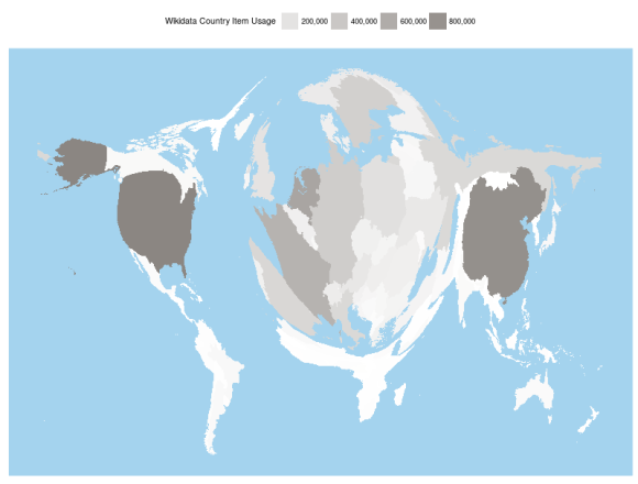
Figure 1. A cartogram of Wikidata usage across more than 800 Wikimedia projects.
This twisted map—a cartogram, more precisely—was generated by a smart GIS algorithm applied to the Wikidata Concepts Monitor (WDCM) data sets. The area of each country is transformed until the areas of all countries became proportional to how many times the Wikidata items that represent them are used across more than 800 Wikimedia projects.
The WDCM system, developed by Wikimedia Deutschland in 2017, has a curious task to track, crack, and visualize the numbers on Wikidata items usage across all Wikimedia projects. It is a statistical machinery that currently tracks 14 semantic categories in Wikidata, currently encompassing 35,153,186 of Wikidata items. Its results are reported across four specialized dashboards: Overview,Usage, Semantics, and Geo, which provides interactive maps of the geolocalized items alongside their usage statistics.
What is the motivation behind the development of such system? Well, no one has probably ever brought a good decision on the direction of development of a large socio-technical system without relying on some appropriate data source of solid quality. Such decisions can be brought in the very beginning of the system’s development, when the matters of its design by definition outweigh the matters of its application. For successful systems like Wikidata, that epoch doesn’t last long, because they tend to grow fast. In order to understand what needs to happen in Wikidata, one needs to understand what are our editor communities doing with it. Beyond that, and even more important, the communities themselves need to understand the pattern of their own Wikidata usage: it is in itself so complicated even in a single project only, that no single individual could understand it easily without relying on a system like WDCM that assesses the relevant numbers in the background and does the math to reduce the system’s manifest complexity to a manageable proportion.
For example, we have millions of things in Wikidata, but do we use them all often? No, we don’t. The bar plot in Figure 2. shows the WDCM Wikidata usage statistics for 14 semantics categories that are currently tracked across the Wikimedia projects. An interesting fact considers the negligible usage of scientific articles (Q13442814) items in Wikipedia—negligible because scientific articles account about ¼ of all Wikidata items. The prevalence in usage of items from the categories of geographical object (Q618123) and human (Q5) says that, on the large scale, Wikipedias are primarily about who and where—the two essential information needed to understand the organization of the social world in general.
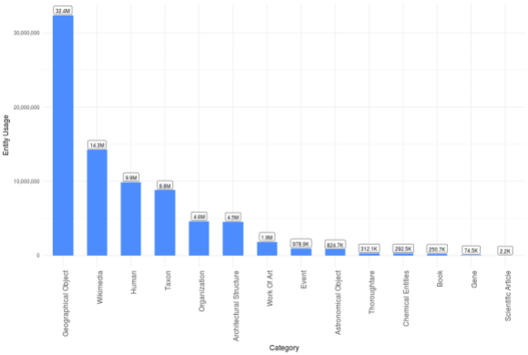
Figure 2. Total Wikidata item usage in 14 semantic categories in Wikipedia. The WDCM usage statistic (vertical axis) is based on the count of the number of pages that make use of a particular Wikidata item at least once. The plot is based on the 1. January 2018. WDCM update. The Wikimedia category encompasses categories, disambiguation pages and templates.
Next, the WDCM data sets are combined with the Wikistats to provide a glimpse of the global Wikidata usage picture for you.
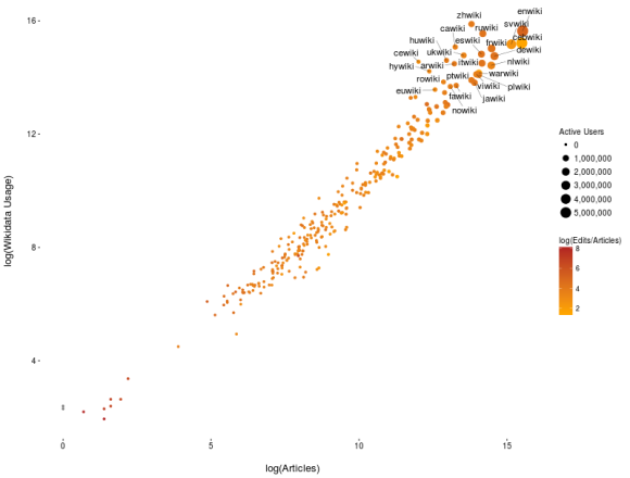
Figure 3. Wikidata usage (vertical axis), number of articles in Wikipedia (horizontal axis), number of edits to number of articles ratio (color scale), and number of active users (marker size).
The measurements are represented on a logarithmic scale to avoid the overcrowding of data points and labels. Each data point represents a particular Wikipedia, while only the top 25 Wikipedias in respect to the volume of Wikidata usage are labeled. The horizontal axis represents the number of articles in the respective project, while the vertical axis stands for the corresponding Wikidata usage statistic. The size of the bubble is proportional to the number of active users in the project, and the color scale represents the edits per article ratio.
WDCM is designed to answer questions like the following:
- How much are the particular classes of Wikidata items used across the Wikimedia projects?
- What are the most frequently used Wikidata items in particular Wikimedia projects or in particular Wikidata classes?
- How can we categorize the Wikimedia projects in respect to the characteristic patterns of Wikidata usage that we discover in them?
- What Wikimedia projects are similar in respect to how they use Wikidata, overall and from the perspective of some particular sets of items?
- How is the Wikidata usage of the geolocalized items (such as those relevant for the GLAM initiatives) spatially distributed?
Answering the first two questions might help you understand the nature of editors’ interests in particular Wikimedia projects or whole groups (Wikipedia, Wiktionary, Wikicite, etc) of projects. That means understanding the content of particular projects: what are they about? What items and broader sets of items do they frequently use? What items or sets of items do they use less frequently?
The third and the fourth question address the structural properties of Wikidata usage: what patterns of Wikidata usage can we recognize in particular projects, and how similar they are in respect to the ways they use of Wikidata? This is where machine learning comes into play. Its results can help us figure out, for example, what well developed projects that use Wikidata a lot are similar to smaller projects that are just beginning to use Wikidata. By knowing that, we already know who can learn from whom, and—the most important thing—who do we need to connect. Essentially, this aspect of WDCM functions as a recommender engine for any community manager who is interested in connecting different communities of editors to improve the usage of Wikidata in Wikipedia and other projects.
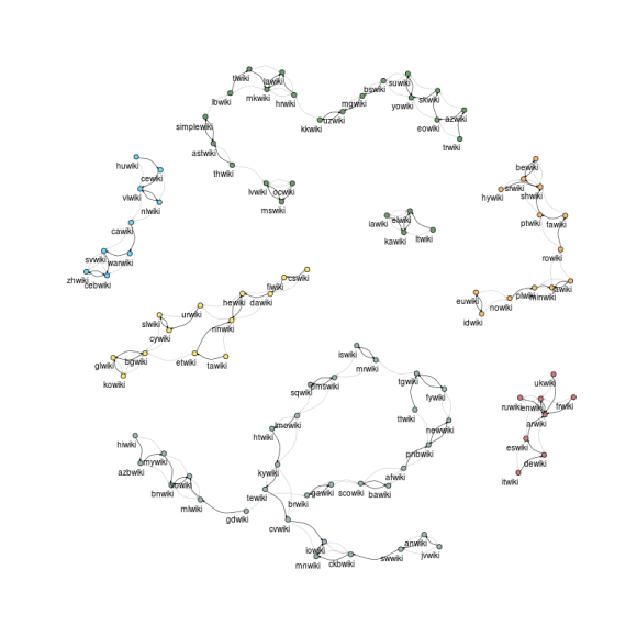
Figure 4. Each node in this directed graph represents one of the top 100 Wikipedias in respect to how much they use Wikidata, and point towards the Wikipedia that uses Wikidata in the way most similar to it (black arrows) and then to the next most similar one (grey arrows).
The graph in Figure 4. groups together the top 100 Wikipedias (top 100 in respect to how much use of Wikidata they make) in clusters that were determined from the statistical patterns of their Wikidata usage. In the 29 January edition of the WDCM Journal—a place where we intend to inform you on the WDCM findings—we will show you how can you discover what projects have a more dynamic, more unpredictable course of development in terms of Wikidata usage, and what projects are currently settled down in some more or less constant strategy of using Wikidata. Also, from the WDCM Journal you can learn more about the methodology used to produce Figure 4.
The solution to the fifth above exemplified problem can help you discover biases in item usage, like the North-South divide in the cartogram in the very beginning of this blog post. GLAM people can observe a similar problem: your galleries, libraries, archives, and museums, shining blue and bright in proportion to their Wikidata usage.
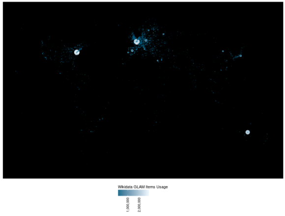
Figure 5. Galleries, libraries, archives, and museums. The color scale as well as the size of the marker represent the Wikidata usage across more than 800 Wikimedia websites.
It does get a bit dark under the Earth’s Equator, don’t you think? The noticeable item in the Southern Hemisphere (lower right corner of the map) is the National Library of Australia (Q623578), which is at the same time the third most frequently used Architectural Structure Wikidata item (following two other libraries, namely the Library of Congress (Q131454) and Bibliothèque nationale de France (Q193563); you can check this fact on the WDCM Usage Dashboard, by selecting the Architectural Structure category in the Category Report section under the Usage tab, and then scrolling down to the top 30 Wikidata items chart). Of course that the argument is that there are not that much GLAM institutions in the Southern as there are in the Northern Hemisphere, but why don’t make more use of them then in Wikipedia and other projects? Because if that is a fact, then people will not easily get to learn about such institutions in the South if we don’t make that knowledge accessible.
WDCM will go beyond these questions in the near future: an index of gender divide in Wikidata usage, i.e. tracking the item usage of the Human (Q5) items in respect to gender and across many Wikimedia projects, is already under development, and will help us quantify this bias and learn where we need to address it more urgently. These and other future WDCM based indicators of Wikidata usage biases are planned as the Knowledge equity components of the system; the rest of the system is designed having in mind the development and promotion of the Knowledge as a service component of the agreed 2030 Wikimedia movement direction.
All WDCM Wikidata usage data sets are publicly available from https://analytics.wikimedia.org/datasets/wdcm/. Many aggregated data sets, including user customized ones, can be downloaded from the WDCM Usage Dashboard.
Goran S. Milovanović, Data Scientist
Wikimedia Germany (Deutschland)
Can you help us translate this article?
In order for this article to reach as many people as possible we would like your help. Can you translate this article to get the message out?
Start translation