In September 2020, we announced a series of desktop improvements coming to Wikipedia. As we look forward to changes to come, we also want to look back and share how this project came to be.
In May 2019, the Wikimedia Foundation Web team was sitting in a room on the ground floor of the Green Garden Hotel in Prague, staring at a large image of Wikipedia projected onto the wall. While we usually worked remotely (even in pre-COVID times), every few months we would gather in-person to go a bit deeper than our video calls allowed for.
The goal of this session, and several others we had that week, was to prepare for collaborative discussions and workshops at the upcoming Wikimania conference around updating Wikipedia’s interface. Fast forward to today, over two years later, when we are piloting proposed desktop improvement features on 15 projects, and getting ready for a full rollout later this year.
The Wikipedia reading experience, which was thoughtfully re-designed back in 2010, has worked well for many years. So you may be wondering: How did it come to be that our team decided to implement a series of improvements to Wikipedia? And how can we know if these improvements are indeed improvements, and are worthwhile to make?
Part of the story is that things on the internet have changed over the past ten years. The population of the world that has access to the internet has expanded. The technology that websites are built with has changed, and, with it, design and interaction patterns have changed. The size of devices and monitors have changed. The variety of content on Wikipedia has changed, and so have the ways in which people consume information.
So while the Wikipedia interface was once doing a great job of meeting people’s needs, it has not adapted in response to the transformation we’ve seen over the past decade. In order to meet our vision of sharing the sum of all knowledge for all people, we recognized that we needed to create an experience that was more inclusive of internet users today and worked to close gaps in access to knowledge.
Another part of the story is that many of the improvements we are making have already been proposed, and, in some cases, implemented, by individual Wikipedians (and even entire Wikimedia projects). Through user scripts, gadgets, and skins, community members have been modifying the interface on their own to meet their needs. However, these improvements haven’t made their way upstream to the general public. So, while the improvements may seem sudden to many, for others they’ve been a long time coming.
And finally, we are a small product department compared with the amount of surface area we are responsible for maintaining (mobile web, desktop web, editing experiences, reading experiences, newcomer experiences, language support, iPhone app, Android app, KaiOS app, etc.). As part of a nonprofit organization, our team is significantly smaller than product departments at larger commercial technology companies supporting websites of similar capacity. Inevitably some of our products and experiences go longer than we’d like without getting re-evaluated and improved. It wasn’t until recently that, with previous obligations and projects wrapped up, the product department was able to prioritize improvements to the desktop site, which was assigned to our team in April 2019.
Part I: Where to begin?
As our team convened in Prague back in 2019, Wikimania, the annual gathering of Wikimedians, was slated to take place in just a few months. We were hoping to get a rough list of features, and a plan for implementation, to discuss at the conference with volunteers.
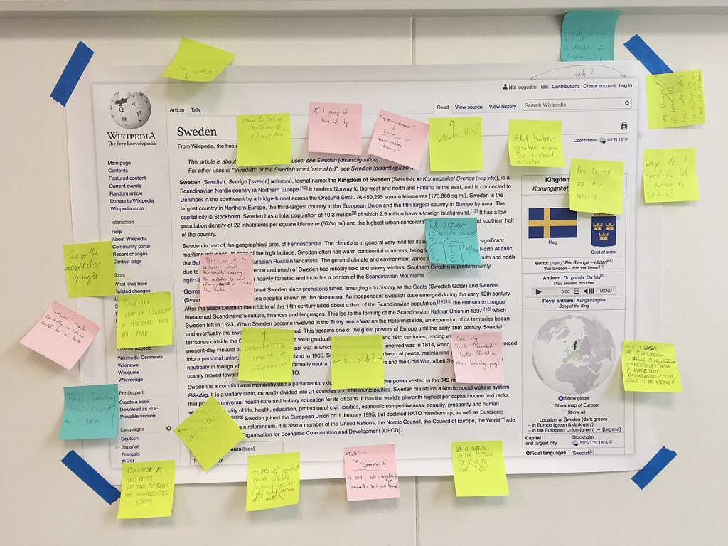
The task was both daunting and exciting. There was a lot of history of past proposals, modifications made by individual users, and stalled improvements to dig through. There was a lot of data to gather about who reads Wikipedia and how they use the interface, and in what ways the current site might be perceived as not welcoming by new users from new geographies. And despite how simple the website seems, there is a lot of complexity — both in terms of the code, as well as many nuanced workflows and locally customized elements — to learn about. On top of all of that, nobody on the team had been around when the current skin, called Vector, was designed and released in 2010.
We all seemed to agree that it was equally important to understand past decisions, and honor the legacy of the interface, as it was to have some sort of vision and courage about how it could be better in the future. To break up the time, we did short presentations about our hobbies (juggling, brewing mead, building synthesizers), played trivia, went out for ramen, and had Olga, our product manager, read tarot cards to predict our fate.
After a few days, many coffees, and a few hundred post-it notes, we had identified five categories of improvements. In no particular order:
- Improving visibility of key features. Important features — such as searching and switching languages — were not in prominent places in the interface. The search bar was relatively small, and located in the article header, rather than in the site header, which is a nearly ubiquitous location across the web. Language links were tucked away in the sidebar, only visible once you had scrolled down the page a bit. In order to better serve a growing population of multilingual users (and those still to come), we elevated these features in line with our movement’s commitment to knowledge equity.
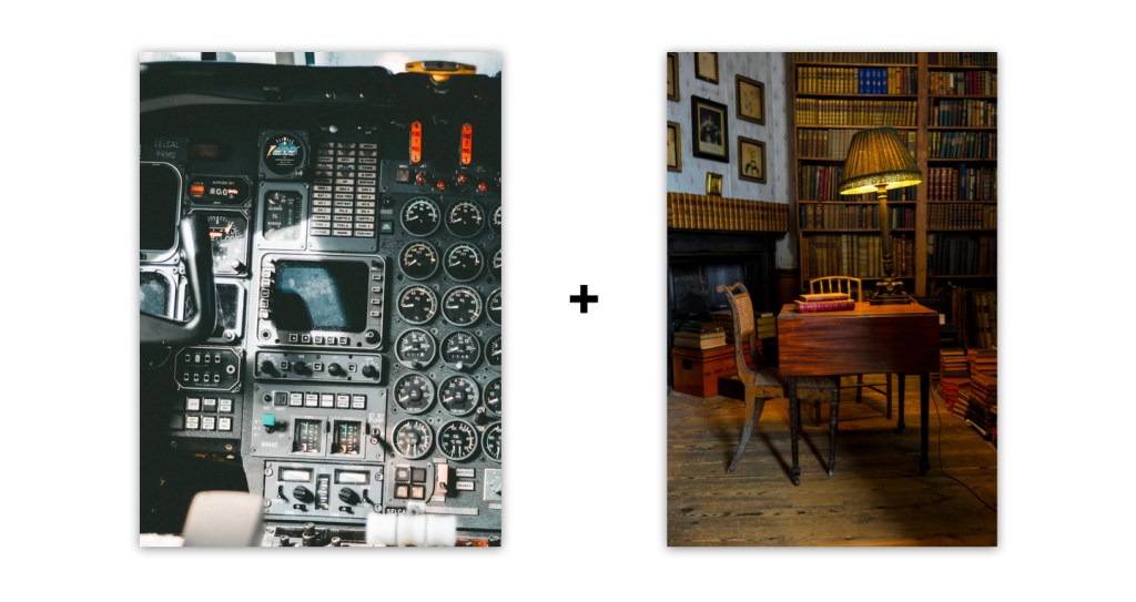
- Addressing needs of different types of people. Wikipedia looked basically the same for logged-in people as it did for logged-out people; however, the needs of these people were quite different. By differentiating the experiences more, we might be able to help logged-out people focus on the content (think of a quiet library), while logged-in people could have a more feature-rich experience that enabled them to both read and contribute (think of the cockpit of an airplane). (Read Wikipedia as a Physical Space for more on this distinction).
- Organizing for clarity. Even for logged-in people who prefer a dense, feature-rich experience, the interface had become cluttered and disorganized over time. Most navigational elements were exposed on the screen at all times (rather than being collapsible in menus), and some elements in prominent locations were hardly being used. Elements with similar functions were sometimes not located near each other. We thought we might be able to make the interface a bit more clear by reorganizing certain elements, and creating menus and other toggleable containers.
- Aligning with readability best practices. The line length and font size of the article text was out of sync with the latest readability research. While people don’t typically read Wikipedia in the same way they might read a long-form essay, the gap between the article text on Wikipedia and analogous long-form reading experiences on the web was significant enough to give us pause.
- Evolving visual design. The aesthetics of the site were notably dated. While this isn’t inherently an issue, we questioned if younger learners and people from different cultural backgrounds would feel welcomed by the visual design of the site. We knew we liked the simple, vernacular design, and that we didn’t want it to look like some slick startup website, but we wondered about the inclusivity of the visual design.
As we looked through various proposals and modifications made by individual Wikipedians, we found evidence that people were already thinking about, and attempting to address, these issues. For example, Korean Wikipedia had implemented a collapsible sidebar. Timeless, a skin created by a volunteer, addressed issues around the prominence of search and language switching. Wikipedia.rehash focused on making the text more readable. Serbian Wikipedia had added an additional language variant switcher in a more obvious location. A proposal for a new Wikipedia skin called Winter focused on grouping relevant elements together and creating a more modular layout.
Korean Wikipedia and a collapsible sidebar 
The Timeless skin addressed issues around the prominence of search and language switching 
Wikipedia.rehash focused on making the text more readable 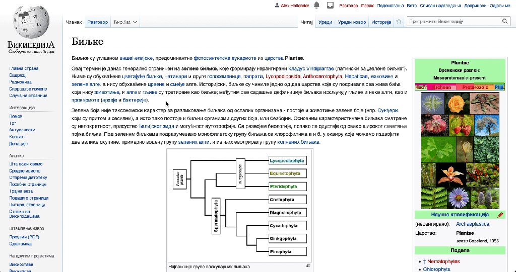
Serbian Wikipedia had added an additional language variant switcher in a more obvious location 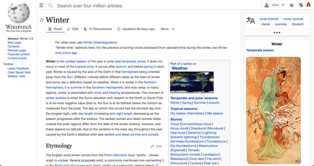
Winter focused on grouping relevant elements together and a more modular layout
In addition to considering what could be improved, we also wanted to be sure to articulate what was working well about the website, to ensure that we protected those things. Namely: the website is incredibly fast to load. According to some studies, site speed is actually the most important user experience feature a website can have, and also makes it accessible to anyone online, regardless of their internet capabilities. Secondly the reading experience is (almost) never interrupted by ads, pop-ups, referrals, distractions, or other requests (yes, we do ask you for donations once a year!). We allow you to focus on whatever it is you came to learn.
Part II: How to proceed?
With some direction and a list of improvements beginning to emerge, we turned our attention to goal setting and testing strategy.
Goal setting
While it felt most natural to us to start by identifying specific improvements we wanted to make, we articulated some higher level goals as well. The purposes of having higher level goals were: to help connect our work with the movement’s goals, and to provide guidance to the feature work should we be faced with difficult tradeoffs. We also knew that while we’re not a metrics-driven community or organization, we were going to need to measure the effects of the work we were doing. We came up with the following:
Goals
- Make Wikimedia projects more welcoming to new readers and editors
- Increase utility amongst readers and maintain utility for existing editors
Targets
- Increase trust and positive sentiment towards our sites (measured qualitatively)
- Increase utility of our sites, measured through proxy metrics by usage of common actions such as search and language switching (measured quantitatively)
- Additional: monitor core metrics throughout the process to identify any other significant effects of the changes
Testing strategy
When thinking about our testing strategy, we identified several goals:
- Expand our testing group to a more diverse set of people, in terms of ages, locations, languages, and more, in order to represent the users we hope to reach on Wikipedia.
- Understand the effects of the individual changes
- Understand the effects of the combination of all the changes
- Disrupt people’s experience as little as possible
- Minimize the amount of interim states the interface would be in as we moved things around
- Give people confidence that there was a comprehensive plan we were working towards
We thought about the tradeoffs between gradual change, where you change individual parts one at a time, and comprehensive change, where you make all of the changes at once. Gradual change is less disruptive for some, but can also be confusing because it results in awkward, in-between states (e.g. Q: why is there so much white space? A: Because the table of contents is eventually going to go there). Comprehensive change is more disruptive for some (hey, everything is different, where is my stuff!?), but does a better job of communicating the overall plan. We discussed the need for extensive documentation, communication, and how we wanted to create opportunities for community participation and feedback throughout the full improvements process.
Another challenge for our testing strategy was that, due to resource and technical limitations, we didn’t have the capability to easily run A/B tests (especially with logged-out people). Because of this, a strategy we often use in our product development is to pick several Wikipedia projects/communities (i.e. pilot wikis) who enjoy testing experimental features, and release the features to them first, knowing they will give us constructive feedback.
Something many people don’t realize is that there are actually around 300 individual Wikipedia projects. And while they are all connected in various ways, French Wikipedia, for example, is actually a separate website from Arabic Wikipedia, Navajo Wikipedia, Korean Wikipedia, etc. This distinction offers us an opportunity from a testing perspective, because we can deploy changes to a limited number of Wikipedias, rather than having to do it all at once.
In addition to finding Wikipedias who would agree to be pilot wikis, and figuring out how we were going to communicate the comprehensive plan to them, we also wanted to determine what sequence to release the changes in.
As mentioned above, part of what makes interface design complex is that the individual elements of an interface are interdependent. For example, you could say that the Wikipedia logo (1) and the sidebar (2) are individual elements serving separate purposes, but their size and placement are dependent upon each other. Making the sidebar collapsible without changing the size and placement of the logo would throw off the visual harmony [GIF]. Additionally, some changes seemed like they would be easier to start with (particularly given that our team was not familiar with the specific codebase). So the sequencing was a puzzle of sorts, which we attempted to solve by trying out all of the proposed changes in various orders and to determine which order would be the least awkward.
The list of improvements, and the sequence we came up with, can be found on our project page: Desktop Improvements/Features.
A few months later, with our rough plan, Olga (our team’s product manager) and myself (our team’s designer) headed to Wikimania where we began sharing our thoughts, collecting feedback, and laying the foundation for the project to come.
As many of us have experienced, change can be hard. Many people, including members of our team, have warm feelings about Wikipedia’s current design and interface. At the same time, we must remember that there are large regions of the world that are not yet fully represented on Wikipedia. It takes intentionality and new ways of working in order to ensure that more people are part of the conversation and ultimately participating in, or contributing to, knowledge for all. And welcoming new people might mean changing things that some experienced folks are familiar with.
We are committed to supporting and including everyone in the sharing of free knowledge — experienced editors, newcomers, and everyone in between. Our next blog post will detail how we tackle the ambitious goal of designing a website for all people, and our approach to inclusivity within the product development process. In the meantime feel free to reach out to us with your thoughts in any language!
Can you help us translate this article?
In order for this article to reach as many people as possible we would like your help. Can you translate this article to get the message out?
Start translation