Using the Wikipedia Android app should be easy and simple — not only for general users but also for people who have special accessibility needs. In a recently released versions of the app, we have done numerous optimization on the accessibility support:
- Some buttons have a small touch size, causing them to be difficult to tap for users with fine motor difficulties.
- Object does not have a readable label, preventing the accessibility service from describing it correctly.
- Insufficient color or text contrast ratio, causing it to be difficult to see for users with vision difficulties.
- Less accessible when loading or focusing on objects, increasing the difficulties of navigation from supporting devices.
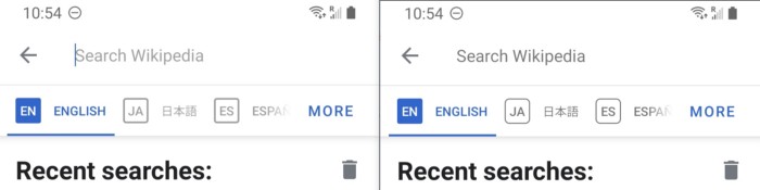
Object has small touch size
Small touch size on a button or an actionable object makes the app less accessible, which impacts users who have fine motor difficulties, and that usually happens on ViewPager indicators, three-dots menu button or Chiplabels.
The ideal size of an actionable object should be 48dp*48dp , which can be done by increasing the layout_width and layout_height , or increasing the layout padding to enlarge the touch area. We will also set ?android:attr/selectableItemBackground to the object’s background or foreground with the click ripple animation in case the user miss the actionable objects.
Object does not have a readable label
Sometimes when a Button object cannot satisfy the specification from our designer, the engineers will use TextViewor ImageView, or even making the whole ViewGroup clickable. This will cause screen reader tools (e.g. Talkback) to not recognize it as an actionable object, which may cause confusion to users with limited vision.
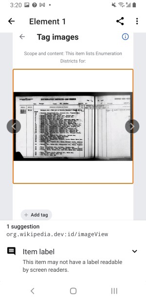
The proper solution for an actionable object: set a string item such as %s button or Image: %s and put it to its android:contentDescription. If the object contains a word with less descriptive to users, such as “Edit” or “Image”, we will have a more detailed description in the android:contentDescription.
Insufficient color or text contrast ratio
When implementing new features or screens for the app, the engineers and designer follow the Android Theme guidelines to utilize consistent colors. It applies to most cases, though we need to take care of exceptional cases that have insufficient contrast ratio, which a lighter color object can be difficult to be found for a user who has vision difficulty.
The issue of insufficient color or text contrast ratio usually happens on “inactive” or “disabled” objects, such as the hint text in a search bar, or the compound icon in a text field. To resolve the issue, we apply a proper color set with a correct opacity on the object to make sure the contrast ratio is sufficient.
Less accessible for focusing or loading objects
We have used a lot of gesture-based actions on the RecyclerView items, such as:
- Swipe to dismiss or remove
- Scroll down to refresh
- Scroll up to load more
- Long press
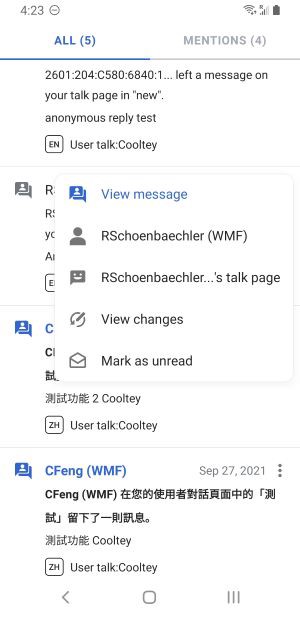
When implementing or designing a new function, we need to pay attention to the accessibility of the function, which the function will need multiple routes to keep up discoverable for users. In one example we have recently implemented, we applied a swipe-to-read gesture function to the Notification screen list, and you can also find the same function — “Mark as read/unread” in the overflow menu.
Some users may use a physical control device such as keypad, a mouse, or a remote control to browse the app, so making the key components accessible or focusable is important. For example, the following code converts the context-click action (the mouse right-click action) and makes it perform as a long-click action.
fun setContextClickAsLongClick(vararg views: View) {
    if (Build.VERSION.SDK_INT >= Build.VERSION_CODES.M) {
        views.forEach {
            it.setOnContextClickListener {
                    obj -> obj.performLongClick()
            }
        }
    }
}
In the Explore feed of the app, we have provided a function that can dynamically load the feed contents when it reaches the bottom of the list, and this seems very natural to general users, but less accessible for some users, which the loading animation may not visible and it is difficult to reach to the bottom of the feed and increasing the difficulty to navigate to the bottom UI. To resolve the issue, we have introduced a solution by adding a button to load the feed contents manually, and it is only available when the accessibility service is on.
Checklist before publishing a new feature
To deliver a good quality of the Wikipedia Android app for users with all types of accessibility needs, a checklist for accessibility before publishing is a must-to-have.

Things we check for in every new feature:
- Make sure actionable buttons are correctly labeled.
1. Show a toast when long-pressing on an icon.
2. Buttons that have the same words must be in separate string items.
3. Add prefix or suffix to the content description of an object. - Make sure the view and text have the correct size.
- Make sure actionable items are focus-able.
- Double-check on color contrasts in different themes.
- Turn on the accessibility service to actually test the new feature.
More to do
We have done much to optimize the accessibility in the app, but some issues still remain in the article screen and editing screen. Our goal is to provide a great app experience with a great UI/UX, no matter how a user accesses it. We will keep working on it and make sure everyone can access the free knowledge from Wikipedia in the app, without hindrance.
If you have any feedback about the accessibility support in the app, please send us a email to android-support@wikimedia.org.
If you are interested in making contributions to the app, please visit our GitHub repository.
Cooltey Feng, Senior Software Engineer, Mobile apps
Wikimedia Foundation
[1] Accessibility services: a built-in service that can be found in the Android settings. You can also find it in Google Play store.
References
- T226401 – Optimize accessibility based on findings from external report
- T285911 – Accessiblity audit
- T294863 – Optimize accessibility support in the Wikipedia Android app
- T280409 – Feature Request: Add better support for screen readers
- Accessibility Scanner by Google
Originally published on Bootcamp by Cooley Feng on January 12, 2022
Can you help us translate this article?
In order for this article to reach as many people as possible we would like your help. Can you translate this article to get the message out?
Start translation