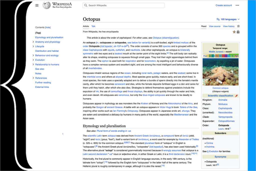
Discover the journey behind Wikipedia’s new look on Diff.
If you are a reader of Wikipedia on desktop, you might have noticed something new over the past couple of days. The website looks a bit different — it’s simpler; less cluttered; and, hopefully, easier to use. After three years of development, the Wikimedia Foundation has finally released the updated desktop interface for Wikipedia. The new look went live today on English Wikipedia, during the month of its 22nd birthday, and is currently live on over 300 language editions of Wikipedia.
The result of the Desktop Improvements Project, the new look was built with the objective of making our interfaces more welcoming for readers globally, and more useful for new and advanced users across Wikimedia projects. The new design is the culmination of years of research, dozens of consultations with movement groups and volunteers, and thousands of points of feedback from Wikipedia readers.
The updated interface improves readability by reducing distraction and clutter and making pages easier to read. It introduces changes to the navigation and layout of the site, adds persistent elements such as a sticky header (a header that moves with you as you scroll) and Table of Contents to make frequently-used actions easier to access, and makes some changes to the overall styling of the page. Our data shows that these changes improve usability, and save time currently spent in scrolling, searching, and navigating – all of which adds up to an easier and more modern reading experience, so that more people will love reading and contributing to Wikipedia.
We are extremely excited for this change and that new audiences will be able to use the desktop site more comfortably. The previous interface, named Vector, had been in use since 2010. When it was developed, it reflected the needs of the readers and editors of the Wikimedia sites at the time. Since then, vast new audiences from a wide variety of cultural backgrounds have begun using the Internet and Wikimedia projects, and our research showed that we were not meeting their needs fully.
The Vector 2022 interface aims to make changes that include the needs of all audiences – both those who have been using the projects for a long time, as well as those who have joined more recently, or have yet to join. We encourage you to read our blog post on equitable product development to gain more insight into the way we identified the needs and included the voices of our large set of audiences into the product development process.
The interface was built and tested in collaboration with different audiences and communities across our projects, and inspired by the ideas and efforts that volunteers had worked on and created over the years. We were lucky to partner with many different language communities, such as French Wikipedia, Korean Wikipedia, Persian Wikipedia, and many more, who tested the interface and new features from its conception and gave us their insights, concerns, and questions, so that we could improve and build based on what our readers and communities truly needed.
In the future, we plan on continuing to listen to our audiences and adapt and improve our experiences based on their needs. In many ways, we see this as a new chapter in the development of our desktop site, a beginning marked with a clean slate on which a wide variety of new features can be built, rather than a static interface we will change once again in a decade. We are excited for these changes, and the opportunities they give us in the future to better serve our audiences. And most of all, we are excited to welcome you to the new experience.
To learn more about the updated desktop interface, see the FAQ. You can also share feedback at this link.

Can you help us translate this article?
In order for this article to reach as many people as possible we would like your help. Can you translate this article to get the message out?
Start translation