After the Turkic Wikimedia Conference was held for the first time in Almaty, Kazakhstan in 2012, it did not take place again for many years. After the decision to reorganize the conference was made by the Wikimedians of Turkic Languages User Group, work began to give the conference a new corporate identity that will be used sustainably every year.
The brand identity, which emerged as a result of a long-term design and application process, will be introduced to the participants for the first time at the Turkic Wikimedia Conference 2023 to be held in Istanbul.
Designer

The brand was created by Graphic Designer User:Kurmanbek (Y. Caner Özyayıkçı), a member of Wikimedia Community User Group Turkey and Wikimedians of Turkic Languages User Group.
Kurmanbek explains his feelings while creating this brand as follows:
I am an active Turkic Wikimedians member due to my interest in Turkic history and languages. When I was offered the task of creating the brand identity of this conference, I accepted it without waiting even 5 seconds. Because it was very honorable and exciting for me to create the brand identity of such a conference that will be used for years.
The draft works I started, inspired by the Yurt, which is one of the traditional houses of the Turkic people and is still used today, were finalized with the logo, the symbol of unity and diversity, which you will see below.
Meaning
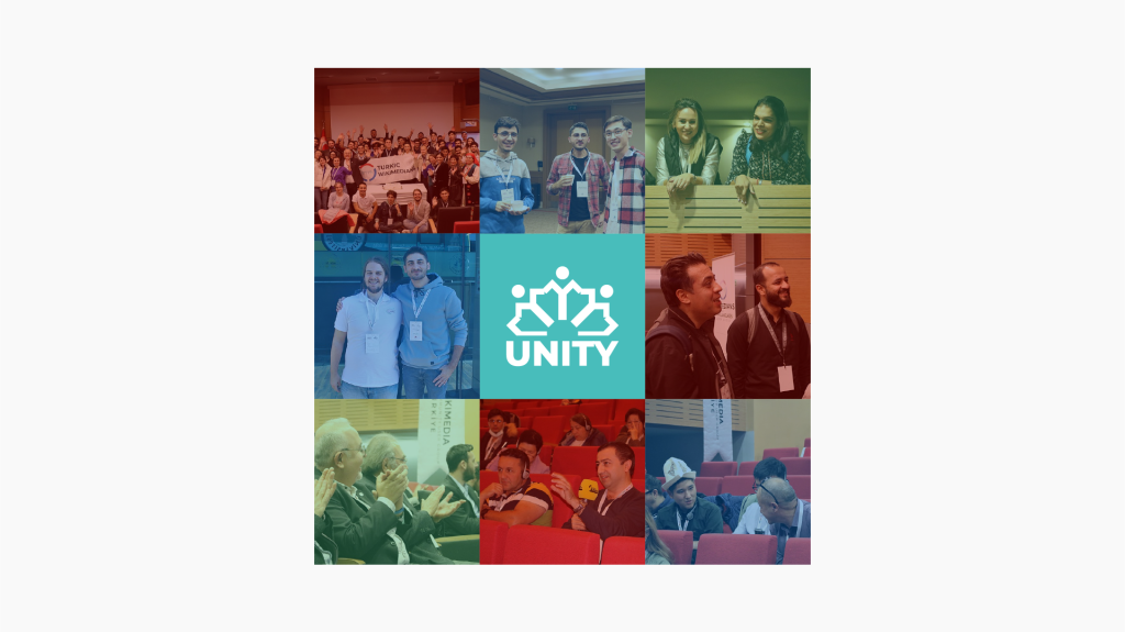
The conference is a conference that unites Wikimedia users in Turkic-speaking countries and surrounding communities and aims to collaborate. For this reason, a human figure holding hands was created, inspired by the historical Orkhon alphabet, the first alphabet of the Turkic people. These people holding hands represent the gathering of users who are interested in Turkic history, Turkic languages, and related focal points, and their cooperation for this goal.
In addition, semantic integrity was supported by choosing the color turquoise, historically known as the Turkic color.
Brandmark

The brand sign consists of people holding hands and united, inspired by the Orkhon Alphabet. These people holding hands represent the conference where participants from the Turkic world and surrounding communities unite for a common goal and interest.
Conference logo
Meet the Turkic Wikimedia Conference logo! The general logo of the conference consists of the brandmark and the text Turkic Wikimedia Conference.
Colors
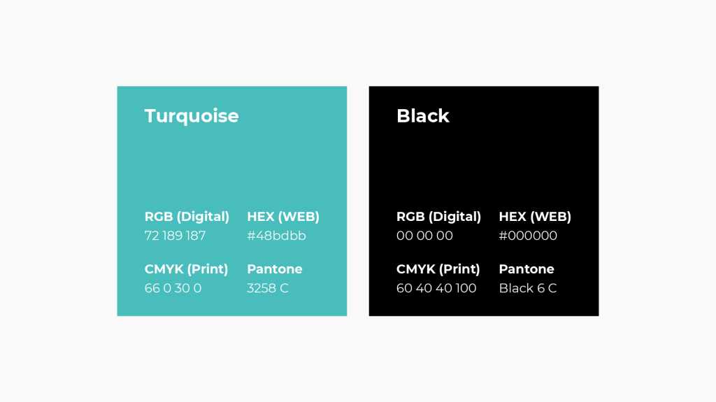
Turquoise color, as it is known, is known as the Turkic color in history. For this reason, the main colors of the brand identity were turquoise and black.
Secondary colors have the same values as the red, green, and blue colors in the corporate identity of the Wikimedia Foundation.
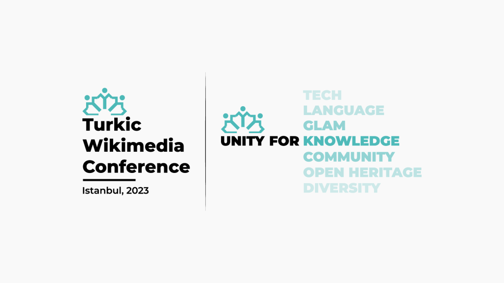
TWC 2023 Istanbul
I would like to briefly talk about the design process of Turkic Wikimedia Conference 2023 Istanbul, as it will be the first conference where this brand identity will be used.
We determined the theme of the Istanbul conference as “Unity”, a reference to the people holding hands in our logo. Not only that, we also created a series of slogans: Such as “Unity for Knowledge”, “Unity for Diversity” and “Unity for Language”…
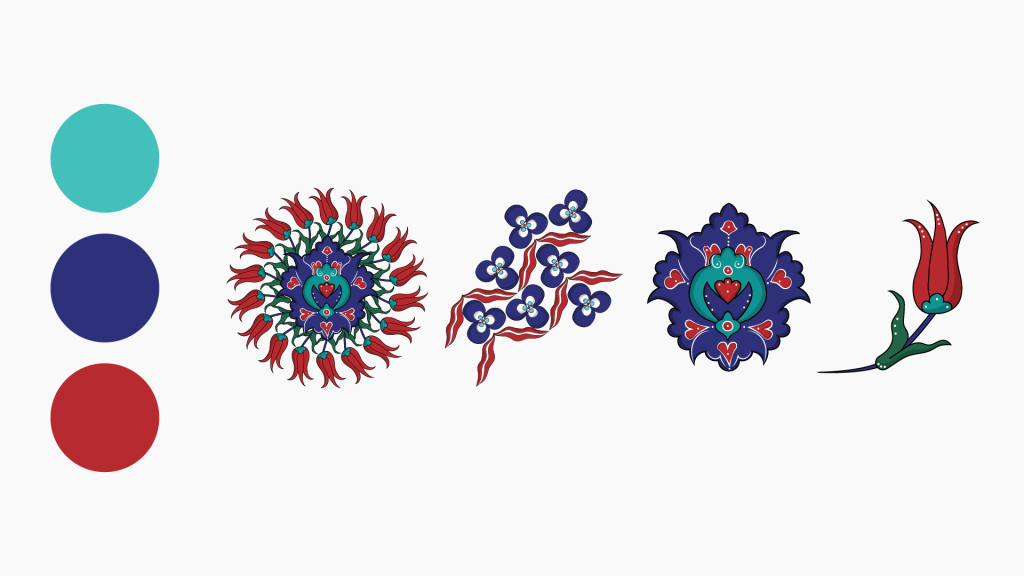
We created the visual theme of the Istanbul conference with Iznik Tiles, also called Turkish tiles. Because when these tiles come together, unity and harmony are created. Just like our conference!
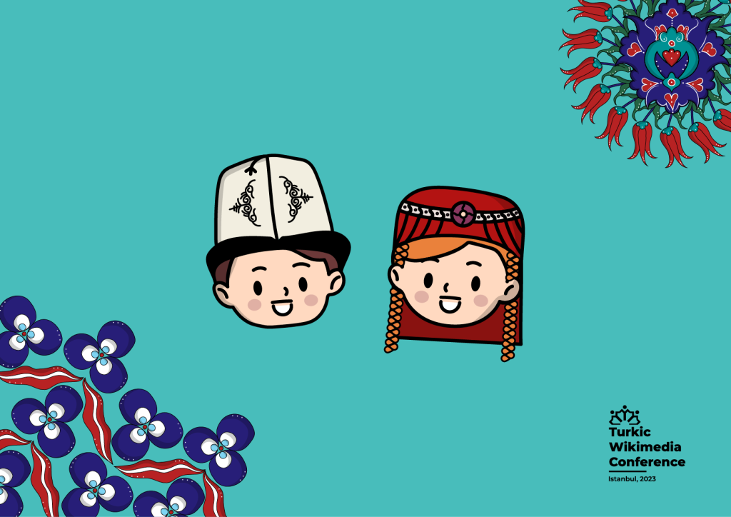
We also designed 2 cute mascots to accompany us throughout the conference. I think these cute mascots will help make the conference participants smile.
Endnote
If you are curious about the details of brand identity, you can review it in its entirety from this link. Thank you for reading!
Can you help us translate this article?
In order for this article to reach as many people as possible we would like your help. Can you translate this article to get the message out?
Start translation