As we wrap out a transformative year, let’s celebrate the progress Codex, the design system for Wikimedia, has made. From user-centric design enhancements to foundational upgrades that empower teams and volunteers for our global user reach.
Changes and Progress that Defined our Year
This year, the Wikimedia Foundation Design System Team has had the pleasure of welcoming many new contributors, from various teams within the Foundation to volunteers from around the world.
We saw significant contributions from both designers and developers alike, which have been instrumental in advancing Codex’s capabilities. These include enhancements like internationalization system, Codex PHP, native constraint validation, and the addition of various design tokens for expanded color palette and dark mode, new components like Table, and icons.
Codex in Action: Key User-Facing Projects of 2024
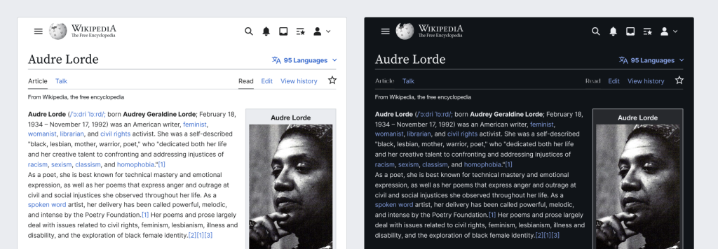
This year, Codex played a pivotal role in powering transformative projects across teams, showcasing its versatility and impact:
Dark Mode in Vector and MinervaNeue
Leveraging Codex’s enhanced design tokens and CSS variable infrastructure, the Web Team delivered a seamless dark mode experience in Vector 22 and MinervaNeue, the default desktop and mobile skins of English Wikipedia and many more wiki projects, ensuring aesthetic and functional parity across modes.
Community Configuration 2.0
The Growth Team harnessed Codex components to elevate user workflows in Community Configuration 2.0, offering a more intuitive and visually engaging interface for helping communities customize wiki features to meet their unique needs.
Collaboration List
Codex’s flexibility enabled the Campaigns Team to craft an accessible and cohesive interface for the new Collaboration List feature, empowering users to track, filter, and manage shared campaigns effortlessly.
Multiblocks
Still in progress, the Multiblocks project by the CommTech Team is shaping up to allow admins to create multiple, overlapping blocks on a single user. Codex’s foundational components and responsive styles are central to its streamlined, user-friendly design.
Migration of Mismatch Finder and Special: NewLexeme from WiKit to Codex
As part of the initiative to consolidate design systems, Wikimedia Deutschland’s migration team successfully transitioned Wikit-based tools to Codex, improving maintainability and aligning them with the latest design standards.
Accessibility, Inclusion, and Usability Features
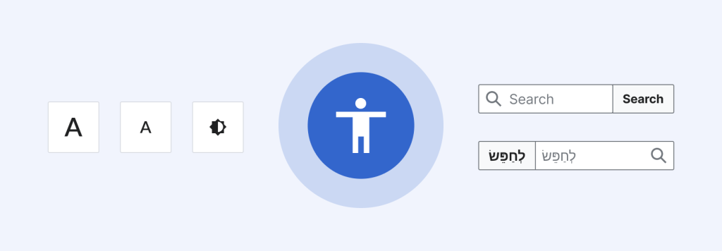
As always, the Design System Team prioritizes accessibility, inclusivity and usability in designing and developing Codex.
- Components Accessibility: Accomplished fine-grained improvements throughout the components of the library by acting on evaluation by our partner, the American Foundation for the Blind.
- Internationalization (i18n): Basic internationalization system established for full language support in MediaWiki’s use of Codex.
- Bi-directionality for Vue apps: Proper RTL support in standalone Vue applications with bi-directional Codex stylesheets.
- Native Validation Support: Simplified validation for the TextInput and TextArea components leveraging the browser’s native Constraint Validation API.
- Field Status Clarity: Status messages gained flexibility with custom slots in Field components, ensuring clarity for varied use cases.
- Support for no-JS environments: Codex provides CSS-only versions of most components, and the new Codex PHP library promises to further streamline the development of high-quality UIs that don’t rely on JS in the user’s browser.
Crafting Design Consistency by Tokens and Styling:
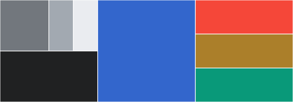
Codex achieved fully supporting dark mode with parity to light mode through CSS variables embedded in design tokens, empowering teams to deliver one of the biggest user-experience rollouts this year, enabling dark mode on Wikipedia and sibling projects using Vector 2022 skin.
In sequence of introducing the modes, a substantial amendment and expansion of the color palette took place, providing more intentional hues which enabled more flexibility for designers and helped address long-standing accessibility and design debt.
Progressive design refinements were made in almost all Codex components for subtle yet impactful visual cues.
New Components

- Table as highly complex component turned into splendid developer experience
- MenuButton with custom menu items and groups
- MultiselectLookup
- Tooltip
- Accordion using details semantic HTML
- Image (WIP)
- Breadcrumb (WIP)
- Toast (WIP)
- ProgressIndicator (WIP)
New Library Capabilities: Codex PHP
Spearheaded by volunteer developer Doğu Abaris, we’ve collaboratively created a standalone PHP library for Codex markup generation as another piece of the Design System – Codex PHP. This library greatly streamlines the process of building complex Codex-based UIs that don’t require JavaScript.
Development Efficiencies: Smarter Code, Faster Builds
Codex’s codebase became more maintainable and forward-looking with:
- Enhanced Modularization: ESM migration across core packages, including tokens and icons, aligned with industry standards for JavaScript ecosystems.
- Design tokens: Made available as ES6 variables.
- Table Improvements: Refactored logic in getRowHeaderScope reduced complexity while bolstering functionality.
- Tables Evolved: Server-side pagination and CSS-only pagination streamlined workflows, while empty state visuals and sorting icons made data presentation more dynamic.
- Integration of native browser validation APIs for some components to reduce friction for developers.
Documentation: Clarity Meets Precision
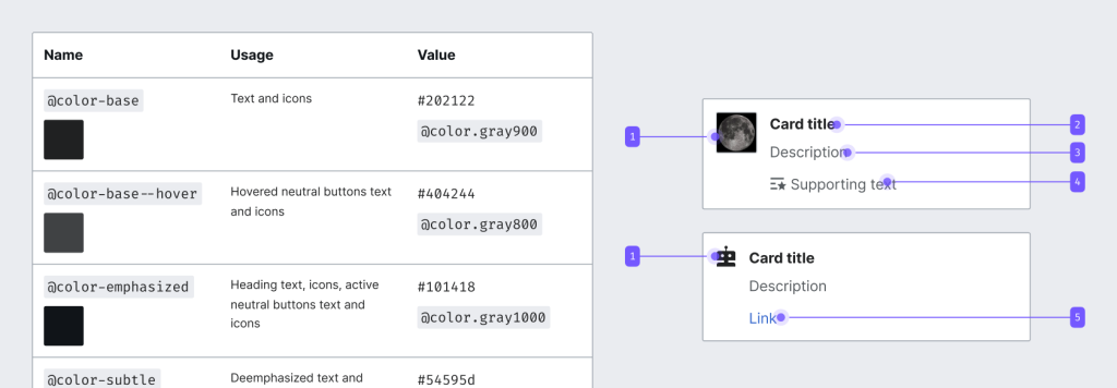
Documentation saw a major overhaul, emphasizing transparency and ease of onboarding:
- Streamlined Color Guidance: Top graphics updated to reflect the unified color palette.
- Interactive Token Tables: Enhanced clarity on token usage with live previews, especially for dark mode tokens.
- Simplified and improved the components’ demo pages and guidelines.
- Added search capability
- Included new guidelines in the Codex Style Guide, such as using links and buttons, constructing forms, and content overflow.
Icons: Simplicity and Utility

The addition of numerous icons underscored Codex’s commitment to universality and usability. These lightweight, versatile assets complemented improvements in accessibility and aesthetic consistency.
What’s Next for 2025?
The groundwork laid this year positions Codex for an exciting year ahead, with version 2.0 on the horizon:
- Accelerating wide adoption of Codex and gaining user satisfaction by providing high-class accessibility, internationalization, and consistent user experience.
- Further improving responsive layouts and behaviors.
- Greater integration of native APIs to more components.
- Expanding the component library with data-rich visualization guidelines and tools.
- Exploring ways to improve internationalization support outside of MediaWiki.
We’d like to thank once more our global volunteers and peers for their relentless focus on innovation, collaboration, and excellence. Together, we are shaping a design system that not only meets the needs of today but anticipates the challenges of tomorrow.
Looking ahead to 2025, Codex 2.0 promises even greater integration, expanded components, and tools to empower Wikimedia projects with consistent, user-centered design.
Can you help us translate this article?
In order for this article to reach as many people as possible we would like your help. Can you translate this article to get the message out?
Start translation