(Update: We’ve received a lot of feedback about how the new Wikipedia identity functions in different browsers, and we’re working on some minor improvements over the next few days. We’ve captured much of the feedback below, and now encourage users to visit this thread on Wikimedia Commons where you can further comment on a revised version, currently being tested on our prototype Wikipedia. Thanks!)
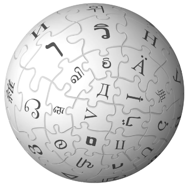
Later today you’ll be reading about one of the first major changes to Wikipedia’s user interface. A significant part of that change is a minor, but noticeable refinement to one of the most-recognized logos on the internet: the Wikipedia puzzle globe.
Our puzzle globe has an amazing story, and its creation and localization across more than 250 distinct language versions of Wikipedia is a collaborative design achievement. The original globe was created in 2003 following a historical logo-creation contest on Wikipedia. The original winning design came from Paul Stansifer (Wikipedia User:Paullusmagnus), a design that was then revised to reflect the international breadth of Wikipedia by David Friedland (User:nohat) — the version users around the world have grown to know as Wikipedia’s puzzle globe.
Just over a year ago we saw a need to update the beloved Wikipedia globe, both to resolve some minor typographic errors found by our volunteers, and to develop a high-resolution version with gradient qualities (it is a sphere, after all) that could be used in a variety of new settings. It was a perfect opportunity to build a new model that would be completely 3D in its design. To complete the project we would need help from a 3D designer, and we’d go back to our community of volunteer contributors to examine what the 52 or so un-identified puzzle pieces might look like.
 A new chapter in the history of the logo was written as volunteers examined languages and scripts that were not represented in the previous iteration of the puzzle globe. Several small errors were corrected, and the Klingon character was replaced with an Amharic character (Klingon Wikipedia wound down in 2005). A great history of the puzzle globe, not surprisingly, can be found on Wikipedia.
The actual 3D construction of the new mark was carried out by a San Francisco bay area professional 3D animator, art director, and graphic designer, Philip Metschan. Through his career Philip has worked for Industrial Light and Magic and Pixar, and currently he’s also a visualization and concept artist for the DIRECT program.
The results are fantastic, and now you can see many new languages and scripts represented. The final state for our puzzle globe is quite similar to the original. The ‘hero’ version closely resembles the shape, and orientation of the original.
You can review more details about the revised identity, and see some of its current physical manifestations, here.
 Aside from the puzzle globe, you’ll also notice a small refinement to the text underneath the puzzle globe. To facilitate the incredible work of our volunteers in localizing the Wikipedia identity into over 250 languages and character sets, it was decided to use Linux Libertine (an open-source typeface) as an alternative to Hoefler. “The Free Encyclopedia” tag line has also lost its italics to facilitate better on-screen reading (although we’re pretty sure everyone on the internet knows those words by now). You can see the incredible volunteer effort of localizing these new Wikipedia identies unfold here.
This is a small part of the next steps for Wikipedia in terms of look and feel, but we hope the revised logo is a useful and more practical tool for our volunteer chapters and volunteers around the world. We’d love to hear your feedback as well, because like any great and visible logo, small improvements are always in store.
 Our thanks to the whole usability team, Philip Metschan, and the dozens of volunteers who have helped make this project a reality. We also recognize the original efforts of David Friedland, Paul Stansifer, and those early pioneers who brought this identity to life in 2003. We hope it’s a lasting tribute and a testament to the incredible impact this symbol makes on millions of people every day.
Jay Walsh, Head of Communications

Can you help us translate this article?
In order for this article to reach as many people as possible we would like your help. Can you translate this article to get the message out?
Start translation