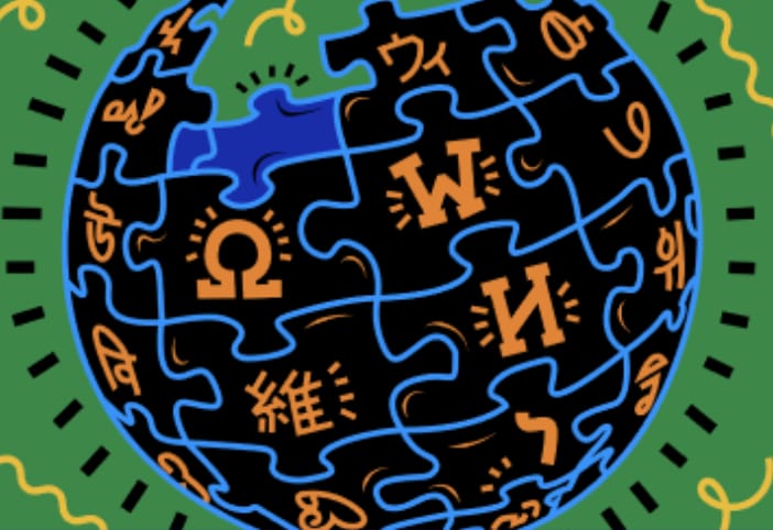
An experienced graphic designer will tell you that good graphic logos are supposed to be simple and so easy to recall that a child can draw them from memory… which means the Wikipedia logo probably wouldn’t be one of them! The puzzle globe logo is however a befitting representation of Wikipedia – it’s busy and complicated. It’s more like an emblem or a coat of arms that proudly shows the history and complexity of the thing it represents. It’s a permanently unfinished work-in-progress that came to be via a logo contest decided by public vote.
After gauging community interest, we are happy to announce that the Wikimedia Foundation will be hosting a global contest to create a sound logo for Wikimedia projects.
Voting for logos is common practice in the Wikimedia movement. As we prepare to launch a new type of logo contest, this blog post takes a look at some of the logo contests that have happened over the course of the past twenty years, as new projects and initiatives across the movement have come to exist. The contests have not been entirely uniform. Some Wikimedia logo contests have one round of voting, some have an elimination round, some have score voting or ranked-choice voting. Some have prizes (which range from t-shirts to a few hundred euros or dollars). Some set aside time for the refinement of the logo. Most voting is open for a week or two.
Some logos are temporary celebrations of particular achievements. These contests are usually shorter in time than other logo contests and go through only one round of voting before being adopted. For example, the Polish Wikipedia held a contest to mark the million articles milestone or the Ukrainian Wikipedia marked its 18th anniversary.

The 2003 ‘International Logo Contest’ gave us the predecessors to the current Wikipedia, Wikimedia, Wikimedia Foundation and MediaWiki logos. The top prize was 100 euros and a t-shirt back then. This was an era when Wikipedia was not a household name and all of Wikipedia was receiving around 250,000 pageviews a day (in 2022 Wikimedia sites receive about 700,000,000 page views a day). The puzzle globe logo won the top prize and the 2nd and 3rd place logos later became used for the Wikimedia, Wikimedia Foundation and MediaWiki logos. Notably, the red, green and blue colors of the early Wikimedia logo became applied to many subsequent logos and logo proposals thereafter.
Many more logo contests came about. In 2004, a need for a media repository for all Wikimedia projects arose and an informal poll was held to vote for a logo for Wikimedia Commons. The poll lasted for two weeks. By 2008, after a clear consensus, it was decided to have a vote to adopt the Wikimedia community logo as the new Metawiki logo, which had been using the Wikimedia movement logo. By 2011, the new Wiki Loves Monuments photo competition held a vote for a new logo, and kept submissions open for a month. Only one week-long round of voting was held. In 2012, the Wikidata logo contest was announced via a blog post, and asked submissions to be uploaded to Wikimedia Commons and tagged into a category to be considered submissions. Then a committee reviewed all the submissions and made a shortlist of finalists which went to public vote.
Wikivoyage was born as an open-source fork of content from a non-Wikimedia site and for Wikimedia servers to host it, it needed a new logo. The community held a contest in 2013 and a logo was adopted, but was later met with a legal challenge for bearing too much resemblance to the World Trade Organization logo. From this came the (sort of) standard ‘logo selection procedure’ we have today: A need for a logo arises, the contest forms with a submission period, an elimination round, a finalist review, and a final vote. The uploader must have created all the work themself and the finalist review exists so that research can be done to see if there are any legal or other issues with the logo finalists.
The ‘Proposal for changing logo of MediaWiki, 2020’ was held to address design issues with the old 2003 MediaWiki logo. The original MediaWiki logo was a bitmap picture so it didn’t work for large sizes, the wide range of colors made it difficult to print, the high details made it unusable in small sizes and it was difficult to modify for things like temporary celebrations. Proposals and discussions for the new logo lasted for six weeks, the first round of voting lasted for a month, then two weeks of legal clearance, then a month-long second round of voting for variants on the top proposals, followed by another month of legal clearance.
The 2021 Wikifunctions logo contest involved two months of discussions, followed by five weeks to submit designs, a few days to narrow the vote candidates, then two weeks for voting. What followed was seven months to refine and finalize the logo because there was a high probability of lawsuits for logos that use the lambda symbol.
For the 2022 Wikimedia Sound Logo contest, we have to consider interesting new aspects like:
- How do we consider vocalizations?
- What technical requirements (bit depth, sampling rate, et cetera) should be made?
- Human hearing is roughly 20 – 20,000 Hertz. Are there accessibility considerations to be made?
- How will we overcome listener fatigue when evaluating a large number of submissions?
- Most sound logos are only a few seconds long. We are proposing submissions between 1 and 4 seconds. What do you think?
- How will we screen for copyright infringement?
- How do we find a large enough group of people with knowledge of audio editing and mixing to submit to the contest?
We encourage you to help us develop this contest on Meta-wiki. Phase 2 of this project is focused on community outreach and discussions with the purpose of co-creating a contest that we can all be excited about. These community conversations are currently planned for May 23 to June 10. More information to come soon. Sign up on the page to stay informed.

Can you help us translate this article?
In order for this article to reach as many people as possible we would like your help. Can you translate this article to get the message out?
Start translation