The goal of this post is to share some details from the experience of implement a dialog with Vue and Codex Wikimedia Design System.
Background
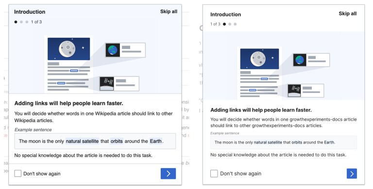
The Growth team built features to guide new users in making edits. As part of the in-context help process, an “onboarding dialog” is shown to users when they arrive at an article page to start a structured task.
As part of the initiative of migrating existing OOUI Growth interfaces to Vue and Codex, the first task in the Growth internship project consisted in the refactor of the “Add a link” onboarding dialog to Vue. The current implementation of this onboarding dialog is based on the OO.ui.ProcessDialog.
To create the Vue and Codex version, we wanted to leverage the functionality and styles of the existing Codex Dialog and add to this component the specific logic required in our use case:
- Step control and navigation between dialog steps
- Support for swipe gestures navigation on touchable devices
- A return value from the dialog when is closed, including the level of completion (steps showed) and if the “Don’t show again” checkbox is checked or not
To achieve this we created a reusable custom dialog where we extended the functionality of the existing Codex dialog.
We considered that this could be also a useful element for other onboarding interfaces that had some shared functionality, so we requested that Design Systems Team add an Onboarding dialog to Codex. This could also contribute to unifying the way of providing onboarding experiences to users within the different Wikimedia projects. The discussion resulted in the development of the <OnboardingDialog> as a Codex component pattern by reusing the Codex dialog component and its styles.
Dialog styles
The first challenges we faced creating our <OnboardingDialog> were related to the dialog styling.
We added to the <CdxDialog> our own LESS classes inside the <OnboardingDialog> component, so we were able to extend the dialog styling with our design specifications. This was the approach we used to set the dialog height and to set the dialog content styles.
But there were also some cases that pointed out either possible customization requests to the existing Codex dialog or a need to update in our interface. Some design requirements for our use case were not reachable in a conventional way, and we had to overwrite some of the Codex dialog classes to fit the specifications.
The dialog header and footer customization support on the <CdxDialog> provided the solution for one of those situations and allowed us to customize the dialog header by adding the stepper component with the information of the progress in the dialog. We also went through the need of overwriting the gap property of the dialog and the body padding to set the full bleed images and the correct gutter between dialog body and header and footer, and this resulted in the removal of dialog body padding and gap styles.
Using codex composables
In Vue 3 composition API, reusability is based on composing state from functions and one of the first advantages is that it enables logic encapsulation and reuse in the form of composables.
Codex library includes a set of composables from which we extensively used useModelWrapper. This composable provides a solution to pass data down via v-model binding from the parent to the inner <CdxDialog> component.
As prop mutation is highly discouraged, we cannot directly write on the prop bound by v-model in the inner component. useModelWrapper provides a solution by returning a computed property that emits an event with the new value, so the parent component is the one that manages the data changes.
We used this composable to handle the Codex dialog’s open prop changes and also to wrap the <OnboardingDialog> isChecked prop, to pass the checked status of the checkbox in the dialog footer.
Navigation and swipe gesture support
We split the navigation logic into a <MultiPane> component placed in the dialog body.
Vue provides a built-in <Transition> component to apply animations to elements entering and leaving the DOM, when an element is inserted or removed inside this component, a group of transition classes are applied. We used this component and created our custom classes to achieve the slide in/out behavior when the steps enter and leave.
Related to the gesture support, as tracked in this Phab task, there is no wide gesture support for touch screens yet included in Codex. To meet the existing “Add a link” dialog swipe gesture support, we added this feature to the <MultiPane> component in a custom way, by listening for touch events in the root element and using useComputedDirection composable to apply the correct navigation action depending on the reading direction. This composable returns the reading direction of the context of the component when it is mounted, so we use it to calculate the navigation depending on the swiping and the reading direction.
Next steps
The OOUI “Add a link” dialog is full screen on mobile devices. To exactly reproduce the existing dialog with our Vue and Codex version, we are missing this behavior. This is something that is being evaluated to include in the <CdxDialog>. Codex library also provides an useResizeObserver composable that we have considered using if we create a custom solution for our use case.
Lastly, images in the existing “Add a link” dialog are implemented as background-images and at the moment we found that this is the most efficient way to add images in our Vue and Codex version. This allows us to take advantage of ResourceLoader image preloading optimization and file name changes to adapt to RTL. An Image component is planned to be added to Codex, and for sure this will provide an improvement in the dialog HTML accessibility by adding images with a more semantic tag.
At the moment, the Vue and Codex prototypes live at the Growth Experiments Frontend documentation site, take a look there for more information and usage details of the new components.
Thanks to Anne Tomasevich, Rita Ho, Chris Ciufo, Bárbara Martínez, Eric Gardner, Roan Kattouw and others who contributed to the process described in this post, and to Sergio Gimeno and Kosta Harlan for reviewing and giving their feedback.
Can you help us translate this article?
In order for this article to reach as many people as possible we would like your help. Can you translate this article to get the message out?
Start translation