Wikipedia is built and edited by the collaborative efforts of volunteers around the world. When it came time to improve the editing features on Wikipedia’s iOS app, we here on the Wikimedia Foundation’s iOS team wanted to ensure that our design process reflected that and the values of our organization, including our design principles.
To accomplish this, we utilized a variety of different open design techniques, including conversations with community members and usability testing, generative research, comparative analysis, and design reviews.
Here’s more about what we did and what we learned from our experiences. We hope that you will also be able to learn from what we did here and apply it to your own product design process.
• • •
Collaborating with the community
At the Wikimedia Hackathon in May 2018, we performed in-person testing of the old iOS editing interface with Wikimedia volunteer editors, the power users who do or could use the feature every day. This helped us understand which parts of the editing workflow they felt could be most improved and what features it would be helpful to introduce into the app. We also participated in an open brainstorming session with the Foundation’s mobile web team, where attendees discussed common use cases and pain points in mobile contribution.
What we learned:
We created a list of requested features and used these findings to gain a better understanding of common use cases for editing on mobile, specifically within the iOS app.
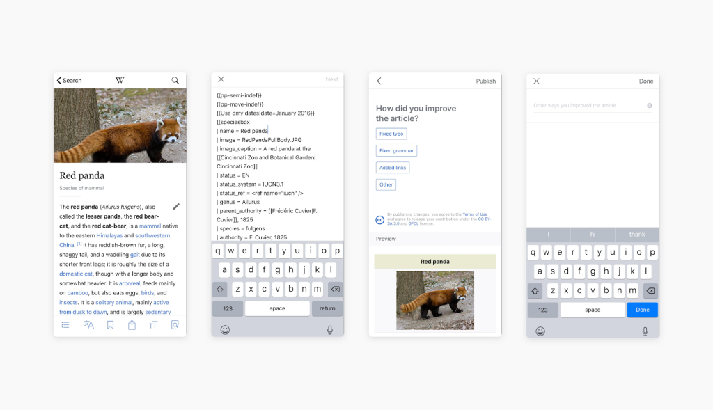
Some of the results were surprising to us. One preconception we held was that users would want or expect to see a MediaWiki-style visual editor within the app. (The visual editor, styled as “VisualEditor,” is a rich-text editing option on most Wikimedia sites.) However, this session showed us that this group of users, who were often fixing small typos or mistakes while on the run, actually desired syntax highlighting for the older “wikitext” editor (similar to an HTML editor).

Utilizing generative research
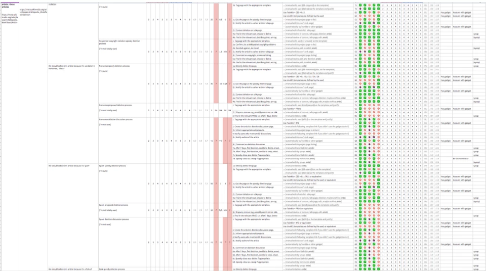
Last year, the Wikimedia Foundation’s Abbey Ripstra and James Forrester created a contribution workflow taxonomy. This work, built off the New Editors research project, resulted in an inventory of 88 workflows and 500 steps used for contributing to the English, Czech, Korean, French and Hindi Wikipedias. These were ranked by most commonly utilized workflows and sorted by potential ease of use on mobile.
What we learned:
From this taxonomy and conversations with the researchers, we were able to identify a set of suggested workflows to bring to the iOS app, including expanding an article, copy-editing or re-writing, adding media from Wikimedia Commons, and tagging a page.

Audit of current features and a comparative analysis
There are five different wikitext and visual editors available on Wikimedia projects for desktop and mobile. We studied them to gain a better understanding of which formatting options and syntax input shortcuts were included in current editors and how these options were grouped, and we were able to compile a list of nearly 50 syntax tags from across all the editors.
We then looked outside Wikipedia for input and inspiration in code editors, markdown note taking apps, and document editors to explore how apps in similar feature spaces were making formatting and writing content on a mobile phone easier or more intuitive for their users. This sort of comparative or competitive analysis is helpful for quickly identifying potentially beneficial design patterns. It entailed looking through the workflows and interfaces of around a dozen apps, while noting down their strengths and weaknesses.
What we learned:
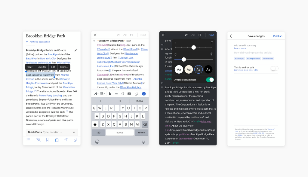
These reviews helped the iOS app team to come up with a list of core UI elements and suggested features that we needed to make sure were included in our work on the Wikipedia iOS editor. Specifically, the comparative analysis helped us to make the decision to utilize a toolbar for presenting formatting options, rather than designing a special keyboard for inputting common syntax elements.
The audit of the current editing interfaces laid the groundwork for the information architecture of the header, toolbar, and submenus, including what elements should be grouped together and what contextual menus should be included.

Design, review, implementation, and iteration
After compiling all the information gathered during research and analysis, our findings were shared across the Wikimedia Foundation’s design and iOS app teams and used to facilitate conversations and plan workboards.
Once an initial set of features was established, we began to build out user flows for the core set of features in Sketch. These early flows mapped out actions that users would take and the system’s response. The goal was to get a better understanding of what screens, error states and messaging would be needed in order to successfully guide users through feature flows.
After developing and reviewing flows for each of the core features, we worked on high-fidelity mocks in the vector graphics editor Sketch, which were then used as internal discussion tools or turned into click-through prototypes. On the iOS team, we tend to begin with high-fidelity mocks instead of wireframes, as many of our UI patterns are either standard iOS components or reused from elsewhere in the app for the sake of consistency and ease of implementation.
Throughout this process, work was reviewed both by the Wikimedia design team and the iOS app team during weekly reviews and sync meetings. Once the mocks and flows had successfully completed rounds of review, engineers on the iOS team began to implement the designs. Before releasing these new features publically, a beta version of the app was published for internal and external testing of features.
The beta version of the app was used for usability testing, both with new and existing users. Due to the number of new features that were to be included in the first editing release, we opted to perform two different types of unmoderated usability testing.
We ran a 15-minute test was published on UserTesting.com, in order to test with new users who had no previous experience editing Wikipedia. The goal of this test was to ensure that new users could find their way through the new editing interface and complete common, core tasks.
To test with experienced users, employees of the Wikimedia Foundation who were iOS users completed a similar set of tasks to the UserTesting.com participants, using their iOS devices and the screen recording feature built into iOS 11 and above. This test helped us to uncover bugs that the iOS team and quality assurance had not previously identified and also helped us to learn more about what additional features experienced users were interested in.
Once identified bugs and usability problems were resolved, the iOS team was able to release a new version of the app to the public and begin our continued work on expanding the editing features available within the app.
What’s next?
The iOS team will continue to focus on the needs of the contributors that make Wikipedia. In upcoming releases we’ll make it easier to insert images from Wikimedia Commons, get feedback on your contributions with streamlined user talk pages, and generally work to make the work flows for participating in Wikipedia on the go far more delightful.
As we work through additional user needs and stories, the open design methods highlighted here will be a core part of our work.
How you can help
The Wikimedia Foundation’s iOS team is always looking for ways to make the app better, and we warmly welcome input and feedback from our users. You can contact us via IRC or by emailing us. The public version of the app—with the new wikitext editor!—is available for download from the app store. If you’re interested in testing out the latest features, you can sign up to become a beta tester within the app.
Additionally, as an open source project, we’re always happy to see volunteer contributions. If you are an iOS developer, you can learn about how to get involved on the Wikimedia mobile engineering contribution page.
Carolyn Li-Madeo, User Experience Designer, Audiences Design
Wikimedia Foundation

Can you help us translate this article?
In order for this article to reach as many people as possible we would like your help. Can you translate this article to get the message out?
Start translation