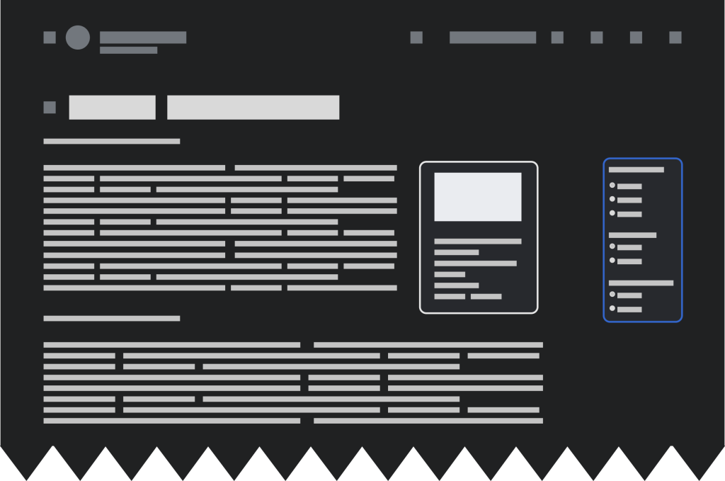
When we’re at night, the white skin of Wikipedia dazzles us and it’s very uncomfortable. I suggest a night mode switch for users or at least a darker color. Also available for the mobile version. – VictorPines, 2017
Some kind of toggleable dark or night-mode. It would be most accessible as a feature for everyone and not just a new skin for logged-in users. – Premeditated Chaos, 2018
Colors of Wikimedia projects are white or near white, which on long view time causes damage to eyes, and consumes more energy on the laptop. – David L, 2021
Please add dark mode!! – Crenshire, 2023
The Wikimedia Foundation has seen many requests like these. Dark mode is available in the Wikipedia mobile apps but still not in the web browser. It’s been a common request from editors in the Community Wishlist Surveys and the rollouts of the Vector 2022 skin – hundreds of comments! We would like to thank for all these.
Some time ago, a few Foundation staff members, Volker, Alex, Carolyn, and MusikAnimal, built a dark mode script as an experiment. It has become a popular gadget across wikis. But until this year, making dark mode a regular part of the interface was not possible. Now, with help from communities, we are finally ready to work on this feature! Continue reading to learn about the benefits of dark mode, what made it possible, and how to get involved.
Why dark mode?
Dark mode improves accessibility. The primary benefit is that it reduces eye strain. When we’re in a long reading or editing session, particularly when it’s dark around us, the contrast between a bright screen and the surrounding darkness can cause discomfort. Dark mode mitigates this by giving us a darker background with light text, reducing glare and minimizing eye fatigue. This feature is especially helpful for night-time readers or readers who spend lots of time on their devices.
Many readers and editors favor dark mode. The softer, darker hues can be less harsh on the eyes and create a more relaxed reading environment, enhancing the reading experience.

What made building dark mode possible?
In the past, it was not possible to change our web interface based on the preferences of logged-out users. These users couldn’t set a preferred page density, change the font size, or set a dark mode. Also, the MediaWiki skin and design architecture made it difficult to maintain two color schemes (light and dark). It was necessary to improve these three facets first.
- We began with improving the skin architecture – we were doing this while building Vector 2022. This laid the foundation for further interface changes.
- Next, the Design Systems team introduced Codex and with it “design tokens”. These are useful variables, like templates on wikis that allow us to make and centralize color definitions.
- Finally, we added the ability to provide preferences for logged-out users. When working on Vector 2022, we built a toggle changing the content area width. After listening to editors’ opinions and some creative thinking, we made it available for logged-out users, too. Next, our engineers and architects created a wider system, allowing us to make more settings customizable.
With this system in place, we could begin planning the Accessibility for reading project. This is our response to users’ need to read the wikis comfortably and to adjust the settings. In the first step, logged-in and logged-out users will be able to select different font sizes and text density. Dark mode will be next.
How? Together. But how exactly, and how to get involved?
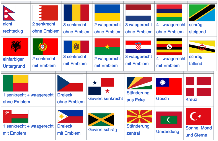
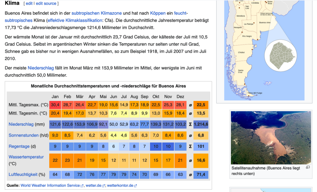
Editors control content which includes templates: amboxes, infoboxes, navboxes, as well as bitmaps, timelines, tables, and more. Some of those, like weather and sports tables, use colors in a meaningful, or semantic, way. Simply inverting these colors would immediately lose their meaning. We need to find other options.


Whatever technical approach we choose, we will coordinate with editors. We may build different solutions for big and small communities. In the coming weeks, we will reach out with specific questions and ideas.
We would like to start gradually, with a limited number of communities and wikis. First, the dark mode would be a beta feature. As such, it would only be available for logged-in users who decide to enable it. Any logged-in user will have an opportunity to test alongside us as we build out the final version.
We will talk to interface admins, template and module maintainers, and editors interested in making the wikis easier to read for everyone. Together with them, we would like to work on recommendations for making pages more friendly to dark mode. We will also help them adjust the current code on the wikis. When enough pages become dark-mode friendly, we will roll dark mode out for logged-out users. (On a side note, we aren’t sure how many pages are enough. We will ask about that, too!)
How do you feel about all this? Write on our project talk page. Be sure to subscribe to the Web team newsletter to never miss an update from us. Thank you!

Can you help us translate this article?
In order for this article to reach as many people as possible we would like your help. Can you translate this article to get the message out?
Start translation